
So, What Exactly Is 4 Colour Printing?
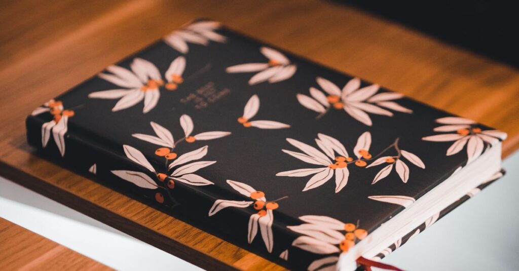
Let me ask you something. Have you ever picked up a notebook and just stared at the cover for a second? Not because it was fancy — but because something about it felt off. The colours looked flat. Or there was this weird yellow tint around the logo. Or the whole thing just looked like it was printed on someone's home printer from 2003.
Yeah. That happens a lot. And the problem usually isn't the design. It's the printing method.
4 colour printing — also called CMYK printing — is the industry standard for getting full-colour images onto paper, cardboard, and notebook covers. It uses four ink colours: Cyan, Magenta, Yellow, and Key (Black). That's it. Mix those four in different amounts, and you can create pretty much any colour you see in a photograph or a logo. At least, that's the theory.
In reality, it's a little messier. And I think that's what most people don't understand. They think 4 colour printing is just a button you press. If you're sourcing notebooks or diaries for your company and want the colours to actually match your brand, Sri Rama Notebooks has been doing this since 1985. So we've seen a thing or two.
How 4 Colour Printing Actually Works — The Short Version
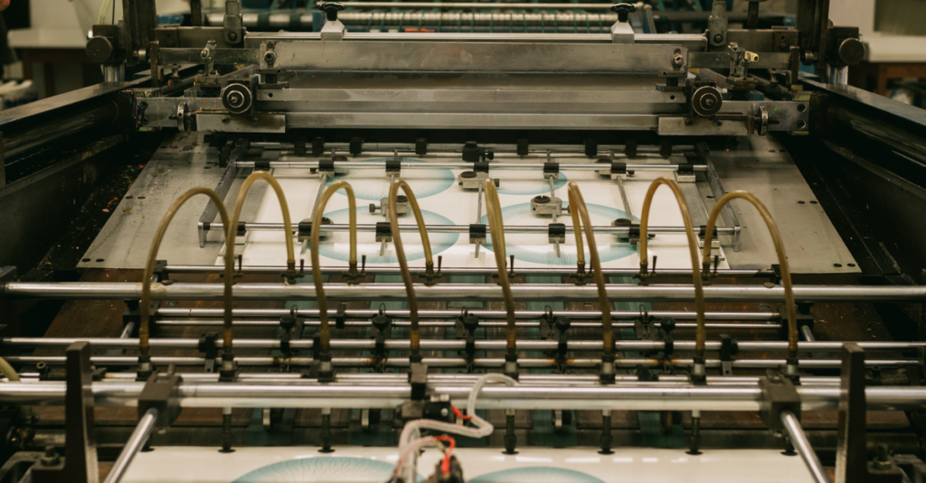
The process sounds simple. You take a digital image. You separate it into four layers — one for cyan, one for magenta, one for yellow, one for black. Each layer gets transferred to a printing plate. The plates go onto a press. The paper runs through, and each layer of ink gets laid down one after the other.
But here's where it gets interesting.
Those dots of ink — they're tiny. Really tiny. Like, you need a magnifying glass to see them. And they're printed at different angles so they don't just pile on top of each other and turn into mud. The human eye blends them together, and you see a smooth image.
That's the theory, anyway. In practice, two things mess it up:
- Paper quality. Cheap paper absorbs ink unevenly. Your beautiful gradient turns into a blotchy mess.
- Registration. If the plates aren't aligned perfectly, your cyan dot lands next to your magenta dot instead of on top of it. Suddenly your crisp black text has a blue ghost.
I've seen this happen more times than I can count. And the fix is usually not what people want to hear: better paper, better plates, slower press speed. Which costs money. But that's a different conversation.
A Comparison: 4 Colour vs. Spot Colour Printing
People often confuse these two. Let me clear it up quickly.
| Feature | 4 Colour Printing (CMYK) | Spot Colour Printing (PMS) |
|---|---|---|
| Colour range | Thousands of colours from 4 inks | One specific colour per ink |
| Best for | Photos, gradients, complex designs | Logos, brand colours, simple graphics |
| Cost per colour | Fixed (4 plates always) | Each extra colour adds cost |
| Colour accuracy | Close but varies by paper | Nearly exact match |
| Common use | Notebook covers, brochures, magazines | Corporate diaries, letterheads, packaging |
| Best for notebooks | Full-colour covers, student notebooks | Brand logos on corporate diaries |
I personally prefer spot colour for corporate diaries where the logo needs to be absolutely bang-on. But for school notebooks with fun illustrations? 4 colour all the way. Different jobs, different tools.
Why 4 Colour Printing Fails More Often Than You Think
Okay, I need to be honest here. A lot of printing companies promise 4 colour printing. And they deliver something that looks like it was left out in the sun for a week.
The biggest culprit? Uncoated paper. Most notebooks use uncoated paper for the covers — feels nicer, more natural, writes better. But uncoated paper is thirsty. It drinks the ink. Your colours come out duller than what you saw on screen. Sometimes 30% duller.
Another mistake: not converting RGB to CMYK properly. Your screen uses RGB (Red, Green, Blue). Printers use CMYK. If you skip the conversion, your bright blue screen colour turns into a muddy grey-blue on paper. I've had clients call me furious about this. And I get it. But it's not the printer's fault. It's the colour space.
Here's what I tell everyone now: if you're ordering 4 colour printing for your notebooks, ask the manufacturer for a printed proof first. Not a PDF proof. A real, physical proof on the actual paper stock you'll use. Because paper changes everything.
Real-Life Micro-Story
Ravi, 34, is a procurement manager at a chain of ten private schools in Visakhapatnam. Last year, he ordered 12,000 customized notebooks for the new academic year. The design had a gradient blue sky with the school emblem. He approved the PDF proof on screen — looked great. When the shipment arrived, the blue was flat. Almost grey. The school principal nearly cancelled the entire order. Ravi spent two weeks negotiating. He now insists on a physical proof with every order. Even pays extra for it. Says it's the cheapest insurance he's ever bought.
When to Choose 4 Colour Printing for Your Notebooks
Not every notebook needs full colour. Actually, most don't. A simple one-colour logo on a solid background can look incredibly clean and professional. But there are situations where 4 colour printing is the only option that makes sense.
Here's when I recommend it:
- School notebooks with illustrations. Kids respond to colour. A cover with a full-colour animal or cartoon image sells better than anything else. Period.
- Corporate diaries with photo content. If your company diary includes team photos, product shots, or any kind of imagery, you need CMYK.
- Branded notebooks for events. Conferences, trade shows, launches — the more visually striking the notebook, the more likely someone keeps it on their desk instead of throwing it away.
- Art and design portfolios. If the notebook itself is a showcase of work, it has to look stunning. No shortcuts.
The tricky part is knowing when it's not worth it. If your design is mostly text and a simple logo, save the money. Use spot colour or even digital printing. Don't let anyone upsell you on 4 colour if you don't need it.
Expert Insight
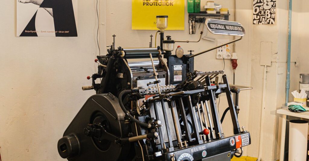
I remember talking to an old press operator at our factory — he's been running Heidelberg machines since the early 90s. He told me something I still think about. He said, 'The best 4 colour print job I ever did was the one where the client trusted me to adjust the colour balance by eye. The ones that went wrong? The client sent a file and demanded we match the screen exactly. Screens lie. Paper tells the truth.' I don't have a better way to put it than that. Trust the person who touches the paper.
The Cost Question: Is 4 Colour Printing More Expensive?
Short answer: yes. But not for the reason most people think.
It's not that the ink is wildly expensive — although quality CMYK inks do cost more than a single black. The real cost comes from setup. Four plates instead of one. Four separate print units to maintain. More time to get the registration perfect. More paper waste during the 'make ready' phase where the operator adjusts everything.
For small quantities — say, under 500 notebooks — the per-unit cost of 4 colour printing is high because you're spreading that setup cost over fewer units. For bulk orders — 5,000 or 10,000 notebooks — the per-unit cost drops dramatically. The setup is the same whether you print 500 or 50,000.
Which means: if you're a school or a company ordering in bulk, 4 colour printing becomes very affordable. The upfront cost feels heavy, but the unit price ends up being pennies per notebook. That's the math most people don't do. They see the invoice total and flinch. They don't calculate the cost per notebook over the full run.
Look, I'm not saying you should always go for full colour. But don't let the initial quote scare you off. Ask for the per-unit price. That's the number that matters.
Frequently Asked Questions
What's the difference between 4 colour printing and full colour printing?
They're the same thing. 4 colour printing is the technical name for the CMYK process. Full colour is just the marketing term. If someone says full colour, ask if they mean 4 colour process or something else. Always clarify.
Can you print 4 colour on both sides of a notebook cover?
Yes, but it costs more because the press has to run the sheets through twice — once for each side. Most notebooks only need printing on the front cover. The back cover usually stays simple or blank. That keeps costs down.
Will my logo colours match exactly with 4 colour printing?
Close, but not exact. CMYK has a smaller colour range than what your screen can display or what spot colours can achieve. If your brand colour is a specific Pantone shade, 4 colour printing will get you near it but not dead on. For exact matches, use spot colour.
What file format is best for 4 colour printing?
PDF with embedded CMYK images is the safest. Make sure all fonts are embedded or converted to outlines. Avoid RGB images, and don't use Microsoft Publisher files. Adobe Illustrator or InDesign exports are ideal. Send your print provider a PDF/X-1a file if possible.
How long does 4 colour printing take for a bulk notebook order?
Setup and plate making takes one to two days. Printing and binding depend on quantity and complexity. For an order of 5,000 notebooks, expect around 7 to 10 working days from approval to dispatch. Rush orders are possible but usually cost a premium.
One Last Thing About 4 Colour Printing
I started this article thinking I'd just explain the process. But honestly? The real takeaway is simpler: 4 colour printing is powerful, but only when you respect its limits. It can't fix bad design. It can't make cheap paper look expensive. It can't match every colour you see on your phone screen.
What it can do — when done right — is make a notebook that someone actually wants to hold onto. Not because the paper is fancy. Because the cover made them stop scrolling for a second. And that's a lot harder than it sounds.
If you're planning a bulk order and want to get the details right — or just want to ask someone who's been doing this since before the internet existed — Sri Rama Notebooks is a phone call away.