

How to Get Brochure Printing and Design Right
I was talking to a client over chai last week — a small business owner from Rajahmundry — and he told me his brochures never got responses. I asked to see one. It was on 80 GSM paper. Looked like a flyer. He spent good money on content, but the physical piece felt cheap. That's the problem with most brochures: the printing and design don't match the effort inside.
Brochure printing and design isn't an afterthought. It's the first handshake with your customer. And if that handshake is limp, you've already lost them. We've been printing at Sri Rama Notebooks since 1985, and the difference between a brochure that works and one that doesn't often comes down to three things: the paper, the finish, and the design.
Let me tell you about one client. A small college in Rajahmundry. They spent a lot on content but went cheap on paper. The brochure looked faded. Felt flimsy. Nobody kept it. They came back six months later asking for a reprint. By then, the event was over.
Why Most Brochures Fail (and How to Avoid It)
Here's the thing: a brochure is a promise. A promise that what's inside is worth your time. If the cover is dull, the paper is thin, or the colors are off — the promise is broken before the first word.
I've seen it happen with a client in Vizag. A tech startup spent a fortune on a designer. Got a beautiful layout. Then they chose the cheapest printing option. The result? The colors were muddy. The text was hard to read on the uncoated paper. They printed 5,000 copies. Used maybe 500.
What they missed: brochure printing and design isn't two separate steps. It's one process. The design needs to match the print capabilities. The paper needs to work with the ink. The fold needs to align with the layout. When these are in sync, the brochure feels solid. Professional.
Three things to get right from the start:
- Paper weight and finish — at least 150 GSM, coated or uncoated based on design
- Color accuracy — CMYK, not RGB, and ask for a proof before bulk run
- Binding or folding — a bad fold ruins the whole piece
The Art and Science of Brochure Design
Designing a brochure is like packing a suitcase. You want everything you need, but if you overstuff it, it's a mess. The best layout is clean, with plenty of white space. One message per panel. Clear call-to-action.
Let me introduce you to Sunita, a 38-year-old marketing manager from Bangalore. She was tasked with designing a catalog for her company's new product line. She spent two weeks on the content, but the layout was crammed. I told her: "You have to kill your darlings. Remove half the text. Let the images breathe." She did. The final brochure was half the pages, but twice as effective.
Design is about guiding the eye. Use hierarchy: headlines first, then subheadings, then body text. And always, always leave room for white space. It's not wasted space — it's visual breathing room.
Digital vs Offset Printing for Brochures
One of the first decisions you'll make is how to print. Two main methods: digital and offset. Each has its place.
| Factor | Digital Printing | Offset Printing |
|---|---|---|
| Best for | Short runs (under 500) | Large volumes (500+) |
| Per-unit cost | Higher per piece | Lower per piece for bulk |
| Setup time | Fast — no plates needed | Slow — plates and setup |
| Color accuracy | Good, but variable | Excellent, consistent |
| Paper options | Limited to standard stocks | Wide variety of papers |
| Special finishes | Limited embossing/foil | Easy with offset |
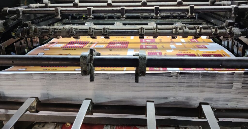
For most corporate brochures under 1,000 copies, digital is fine. But if you need consistent color across a large run, go offset. We offer both at our facility — check our printing services page.
Expert Insight: A Lesson from a Client Who Redesigned Everything
Expert Insight
I remember a conversation a few years ago with a distributor from Kakinada. He had been using the same brochure template for ten years. It was tired. He knew it. But he didn't want to spend the money to redesign. One day, a new competitor showed up with a sharp, modern brochure. He lost three big accounts. I told him — and I was being honest — that sometimes you have to break the old thing to build something better. He came back a month later with a completely new design. It cost him some rupees upfront, but he said it was the best investment he made that year. It's funny how a piece of paper can shift perception that much.
Customization Options for Corporate Brochures
Brochure printing and design isn't one-size-fits-all. Different industries need different approaches. A school brochure needs bright colors and lots of photos. A corporate annual report needs clean typography and a matte finish. A product catalog needs durable paper and maybe spiral binding so it lies flat.
Here are some customization options we often recommend:
- Foil stamping for logos and titles — adds a premium feel
- Embossing or debossing — gives texture to the cover
- Spot UV coating — makes certain areas glossy
- Custom die-cut shapes — for unique presentation
- Binding: saddle-stitch, spiral, perfect bound
Don't just think about what looks good. Actually, that's not quite right — think about what looks good AND how it will be used. Think about whether the brochure will sit in a rack, be mailed, or handed out at events. That changes the design and paper choice.
How to Choose a Brochure Printing Partner
You can have the best design in the world, but if the printer messes up the color or uses the wrong paper, it's all wasted. Choosing a printer is about trust and capability.
A few things to ask before ordering:
- Can they show you a proof before printing?
- Do they have experience with the paper type you want?
- What is their turnaround time?
- Can they handle your quantity without sacrificing quality?
I'm biased, but I'd say look for a printer who has been around a while. We've been at Sri Rama Notebooks since 1985, and we've seen every mistake you can make. We know how to avoid them. If you're planning a brochure run, we'd be happy to talk through your options.
Frequently Asked Questions
What is the best paper for brochure printing?
For most brochures, 150-200 GSM coated paper works well. Coated paper gives sharper images and bright colors. For a more premium feel, go with matte or silk finish. Avoid uncoated paper if you have lots of photos.
How much does brochure design cost?
It varies widely depending on the designer. A basic single-fold brochure can start around ₹5,000 for design, while complex multi-page catalogs can cost ₹30,000 or more. Always get a quote and a sample before commissioning.
What is the difference between brochure printing and design?
Design is the creative part: layout, colors, images, typography. Printing is the physical production: paper, ink, binding, finishing. Both are equally important. A great design on bad paper looks cheap. Great printing on bad design confuses the reader.
Can I get a proof before bulk brochure printing?
Yes, always ask for a digital proof or a physical sample before full production. This ensures colors, alignment, and design are correct. Reputable printers like Sri Rama Notebooks provide proofs as standard practice.
How long does brochure printing take?
For short runs (under 500), turnaround is usually 3-5 business days. Larger runs or custom finishes may take 7-10 days. Rush orders are possible but may cost extra. Plan ahead, especially for events.
I don't think there's a perfect brochure. Every project has constraints — budget, time, quantity. But the ones that get results are the ones where someone cared about the details. The paper. The fold. The color. That's what brochure printing and design comes down to. Caring enough to get it right.
If you've got a brochure project coming up, we're here to help. No pressure. Just good advice from people who've been doing this a long time.