

What Are Colour Copies, Really?
Most people don't think about colour copies until they see their custom notebooks come out looking washed out. Then it's the only thing they think about. I've seen it happen with clients who ordered five thousand diaries for a corporate event and got back something that looked like cheap photocopies instead of branded stationery. That's the problem with colour copies — when they're done right, nobody notices. When they're wrong, everybody does.
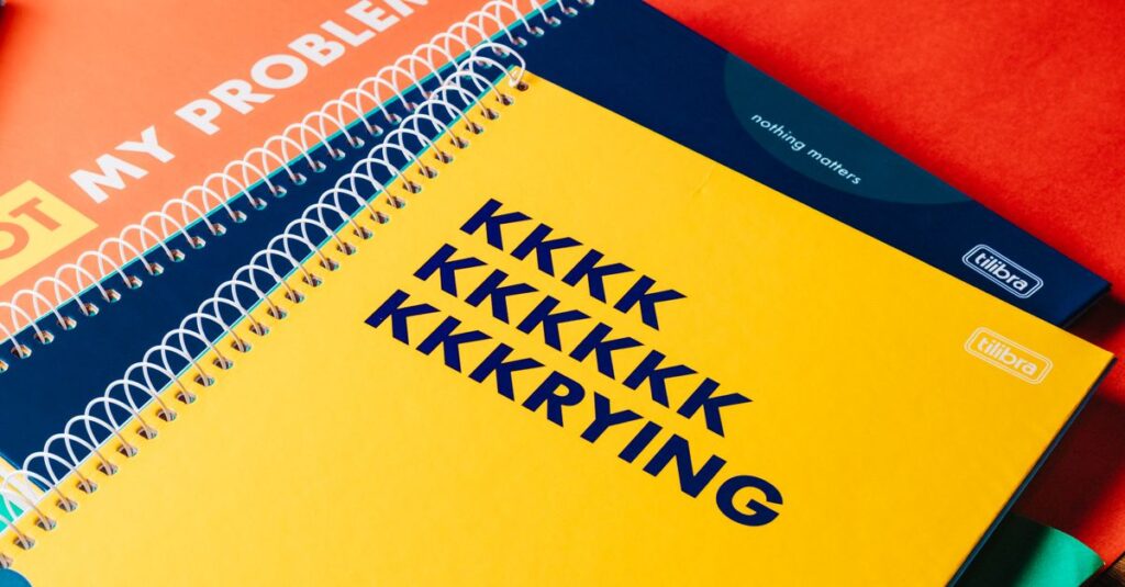
So what exactly do we mean by colour copies in notebook manufacturing? It's the process of printing full-color designs — logos, covers, inside pages, even full-bleed artwork — onto notebook covers or pages. Not just black text on white paper, but actual colour. Think of it as the difference between a black-and-white flyer and a glossy magazine. Same idea.
At Sri Rama Notebooks, colour copies are a big part of what we do. We've been at it since 1985, so we've seen the technology shift from basic offset to digital to hybrid systems. Each method has its own quirks. And each one gives a different result.
But here's the thing I keep telling people: colour copies aren't just about making things look pretty. They're about identity. A school notebook with a bright, accurate logo tells students this is their school. A corporate diary with a rich cover colour says this company cares about details. Colour copies carry weight.
Why Colour Quality Matters More Than You Think
I talked to Ravi last month. He's 34, works as a procurement manager for a tech firm in Hyderabad. He ordered 2,000 custom diaries for a client event. The supplier he used gave him a good price. But when the boxes arrived, the colour on the covers was off — the company's signature blue looked purple. Ravi called me, frustrated. 'How does this happen?' he asked. I told him it's usually one of three things: poor print calibration, bad colour management, or cheap paper that absorbs ink unevenly.
That's the problem with colour copies — they're only as good as the weakest link in the chain. Get any part wrong and the result looks amateurish. And for corporate buyers? That's a reputation risk.
Here are the common factors that affect colour copy quality:
- Paper type and GSM: Heavier paper holds ink better. 70 GSM copier paper won't give you the same result as 100 GSM art paper.
- Print method: Digital colour copies are fast, but offset gives richer, more consistent colour for large runs.
- Prepress proofing: If you don't get a physical proof, you're gambling with colour accuracy.
- Machine calibration: Even the best printer needs regular maintenance. We run calibration checks daily.
Look, I'll be honest: most people don't think about colour copies until it's too late. They assume the printing will just work. And that assumption costs them time, money, and sometimes clients.
Digital vs Offset Colour Copies: A Comparison
Not all colour copies are created equal. The two main methods — digital and offset — serve different needs. Here's a quick comparison so you know what to expect.
| Aspect | Digital Colour Copies | Offset Colour Copies |
|---|---|---|
| Best for quantity | 50–500 copies | 1,000+ copies |
| Per-unit cost | Higher for large runs | Much lower for bulk |
| Colour accuracy | Good, but can vary slightly between machines | Excellent, once press is set up |
| Turnaround time | Fast — same day possible | Requires plate making + drying time |
| Customization per copy | Easy — each copy can be different (variable data) | All copies identical |
| Paper options | Limited to what the digital press can handle | Wide range — coated, uncoated, textured, etc. |
Which one is better? Depends on what you need. For a small batch of custom notebooks with a logo change on each cover, digital colour copies are your friend. For a bulk order of 5,000 corporate diaries with a fixed design, offset gives you better colour consistency and lower cost per unit.
How We Handle Colour Copies at Sri Rama Notebooks
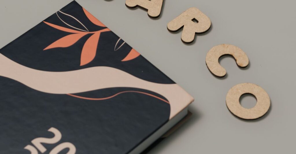
I remember a job we did back in 2015. A client from Dubai wanted diaries with a specific shade of teal — not green, not blue, but exactly the colour of the Arabian Gulf at midday. They sent us a fabric swatch. We ran three test proofs before we got it right. That taught me something: colour copies are about getting the details right, not just pressing a button.
Expert Insight
I was reading something last month about how the human eye perceives colour. Apparently we can distinguish about a million shades, but different lighting conditions change how we see them. That's why we always view colour proofs under daylight-matching bulbs. A colour that looks perfect at 2pm might look flat at 6pm. Small thing, but it matters.
Anyway. Where was I. Right — our process. We start with your design file. We check the colour space — CMYK, not RGB, because that's what printing uses. Then we run a digital proof first. If you approve, we move to production. For offset, we create plates and do a press check. We pull samples mid-run to catch any drift. If you want to see for yourself, our printing services page explains more. Or call me directly — I'd rather talk about your project than have you guess.
Common Mistakes People Make When Ordering Colour Copies
I've seen enough orders go sideways to know the pattern. Here are the biggest mistakes, in no particular order.
- Skipping the proof. You might think you know what the file looks like, but screens vary. Get a physical proof every time.
- Using RGB files. Screens show RGB. Printers use CMYK. If you send RGB, the colour copies will shift — often dramatically.
- Choosing the wrong paper. Glossy paper makes colours pop but shows fingerprints. Matte paper looks more professional but may dull some shades. Think about use case.
- Not checking the finish. Coating matters. A UV coating can deepen colours, but lamination gives a different feel. Don't assume the default finish is right for you.
- Assuming cheap colour copies look the same. They don't. I'm sorry, but a ₹2 colour copy won't match a ₹5 one. The ink coverage, machine quality, and operator skill all show.
I've heard people say, 'Oh, any print shop can do colour copies.' And sure, they can press a button. But getting the colour right, consistently, across 10,000 units? That's a different skill set.
Frequently Asked Questions
What is the minimum order for custom colour copies?
We can do as few as 50 notebooks with colour cover printing. For full colour inside pages, the minimum is usually 200 units because setup time is higher. Contact us with your quantity and we'll advise.
Can I get Pantone colours matched exactly?
Yes, we offer Pantone matching for offset printing. For digital colour copies, we get close but not identical to Pantone standards. We recommend requesting a physical swatch before production.
How long does it take to produce colour copies on notebooks?
Digital jobs can turn around in 5–7 business days. Offset jobs take 10–15 days because of plate making and drying. Larger quantities may need more time. We always give a timeline before starting.
What file format do you need for colour copies?
We prefer PDF or AI files saved in CMYK colour mode, with all fonts outlined. High-resolution images (300 DPI) are essential for sharp results. We can accept other formats, but there may be extra charges for file conversion.
Do you offer colour matching for multiple items in an order?
Yes. If you need notebooks, diaries, and account books all with the same colour cover, we can match them across different products. We run a press check for each product to ensure consistency.
The truth is, colour copies aren't complicated — but they're not simple either. Three takeaways if you're ordering bulk notebooks: 1) always get a physical proof, 2) choose the right print method for your quantity, and 3) don't cut corners on paper quality. I don't think there's one perfect way to do colour copies. Probably there isn't. But if you've read this far, you already know what matters — you just need someone who can deliver it. That's what Sri Rama Notebooks does. Give us a call.