You'd think picking a print color for a notebook would be straightforward. Pick a shade, send it to the printer, done. But if you've ever ordered custom notebooks in bulk, you know it's rarely that simple. Suddenly you're dealing with PMS codes, CMYK vs RGB, and wondering why the blue you chose looks purple on paper. That's the reality of print color — and it's why understanding it matters. Not just for the look, but for your budget and timeline. Sri Rama Notebooks deals with these questions daily. So let's break down what print color actually means when you're ordering custom notebooks.
What Exactly Is Print Color in Notebook Manufacturing?
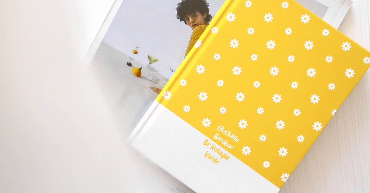
Every notebook cover, every logo, every line inside — that's print color at work. In manufacturing, we talk about two main methods: spot color and full-color process. Spot color uses pre-mixed ink (Pantone or custom blended) for each color. Full color, or CMYK, mixes cyan, magenta, yellow, and black to create the full spectrum. Most notebooks use spot color for simple logos and full color for photographic prints.
But here's the catch: what you see on screen is never exactly what you get on paper. Screens use RGB (red, green, blue) which is wider than CMYK. So that bright red in your logo might turn into a muddy brick red on the cover. That's not a mistake — it's physics. And it's why we always recommend ordering a physical proof before a full run. Especially if print color accuracy matters to your brand. Because once 30,000 notebooks roll off the line, you can't undo it.
Common color types we handle:
- Spot color (one to four specific inks, great for logos)
- Full color CMYK (for photos, gradients, complex designs)
- Pantone matching (get exact corporate colors)
- Foil stamping (metallic gold, silver — not ink, but still a print finish)
And yes — you can mix them. A spot color logo with a full-color background. But that changes the cost. Which brings us to the next thing.
Spot Color vs Full Color — The Real Tradeoff
Most buyers I talk to want the cheapest option that still looks good. Nothing wrong with that. But you need to know what you're trading. Spot color is cheaper for large runs with few colors. Full color gives you more flexibility but can eat into your margin if you're not careful.
Here's a comparison that might help:
| Feature | Spot Color | Full Color (CMYK) |
|---|---|---|
| Cost per unit (high volume) | Lower (2–3 colors) | Higher (4 plates) |
| Color accuracy | Very high (exact PMS match) | Good, but depends on calibration |
| Best for | Simple logos, text, solid areas | Photos, gradients, multi-color art |
| Number of colors limit | Usually 1–4 colors | Unlimited (within CMYK gamut) |
| Minimum quantity | 500+ (offset economic) | 50+ (digital works too) |
Which one should you pick? Depends on your design and your budget. I've seen schools save 30% by switching from full color to a two-color spot logo on the cover. But I've also seen corporate clients insist on full color for a photo of their office — and it was worth every rupee. The key is knowing the tradeoffs before you place the order.
What Real Buyers Get Wrong About Print Color
Let me tell you about Ravi. He's 42, a procurement manager in Chennai, and he ordered 2,000 diaries for a tech conference. He sent us a PDF with a sleek gradient logo. Looked amazing on his Mac. When the proof came back, the gradient was flat. Banding everywhere. He was furious — until I explained that gradients need high-resolution files and often additional screening. He hadn't accounted for that.
This happens more than you'd think. People trust their monitor. They forget that print color behaves differently on coated vs uncoated paper, under different lighting, and with different ink densities. A few things I always tell buyers:
- Always request a hard proof before full production.
- Provide files in CMYK, not RGB. Convert them yourself if possible.
- If you need a Pantone match, give us the PMS number — don't just show a screen sample.
- Be realistic about how many colors you actually need.
The biggest mistake? Assuming more colors means better quality. Sometimes a single bold spot color on a textured cover looks more premium than a muddy four-color mess. Less can be more — especially when you're buying in bulk.
Expert Insight
I was talking to our senior press operator last month — Ramesh, been here since the 90s — and he told me something that stuck. He said the hardest part of his job isn't matching colors. It's convincing clients that their Pantone choice will look different on 60 GSM paper vs 300 GSM board. He's right. Paper absorbs ink. Coated paper reflects. Uncoated paper soaks. Same ink, entirely different result. I think about that every time a customer says "but it looked perfect on screen."
How Print Color Affects Cost and Turnaround
Every color adds a plate. Every plate adds setup time. Every setup adds cost. That's the simple math. With spot color, you pay per ink station — so a two-color job is cheaper than four. With full color, you're paying for four plates regardless, but digital printing eliminates some of that upfront cost for small runs.
Here's a rough rule I use: if your order is under 500 units and you need full color, go digital. Above 500, offset is better — but only if you have a simple design. Complex full-color offset can take up to two weeks for setup alone. We produce 30,000–40,000 notebooks daily, so we can push orders fast — but only if the print color specs are locked in early.
And then there's drying time. Full color takes longer to dry on coated paper. Spot color? Dries faster. If you're on a tight schedule, that matters. I've had clients call a week before an event expecting a rush order of full-color notebooks. Sometimes we can do it. Sometimes we can't. The ones who plan ahead always get better results.
Frequently Asked Questions
What is print color in notebook manufacturing?
Print color refers to the method used to apply ink onto the notebook cover or pages. The two main types are spot color (pre-mixed, exact match) and full-color CMYK (process color for photos and gradients). The choice affects cost, accuracy, and turnaround time.
What's the difference between CMYK and PMS for print color?
CMYK uses four standard inks (cyan, magenta, yellow, black) to create colors. PMS (Pantone Matching System) uses pre-mixed formulas for exact colors. PMS is more accurate for corporate logos but can be more expensive. CMYK is better for full-color images.
Can I print metallic colors on notebooks?
Yes, metallic colors like gold and silver are achieved through foil stamping or metallic inks. Foil stamping applies a thin metal layer, while metallic inks contain fine metal particles. Both are spot processes and cost extra. They work best on dark or textured covers.
How many colors can I use on a notebook cover?
Technically, you can use as many as you want — but cost increases with each additional spot color. For full-color CMYK, there's no limit within the gamut, but complex designs may require higher resolution files and longer setup. Practical limit for spot color is 4 colors.
What file format should I provide for color printing?
High-resolution PDF with CMYK color mode, all fonts outlined, and a bleed of 3mm on each side. Include any Pantone references if using spot colors. Avoid uploading JPEGs from websites — those are RGB and often low-res. Vector files (AI, EPS) are best for logos.
Conclusion
Print color isn't complicated once you understand the basics. Two things matter most: matching your design intent and managing your budget. Don't rely on your screen. Don't assume more colors equals better. And always ask for a proof before production. Maybe you don't need full color. Maybe a single spot color does the job. I don't have a perfect answer for every order — it depends. But if you've read this far, you're already thinking about it the right way. Sri Rama Notebooks has been doing this since 1985. We can help you figure out the right print color for your next bulk order.