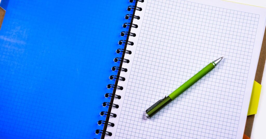
The Real Reason Your Notebook Cover Design Matters
You know that feeling? You get the notebook samples. You open the box. And before you even check the paper or the binding, you just look at the cover. It feels cheap, or flimsy, or the colors are off. Your gut tightens. Because you know — everyone from the procurement committee to the kid in the classroom is going to make that same snap judgment. And you’re the one who chose it.
Here’s the thing nobody says out loud in a business meeting: notebook cover design isn’t about being pretty. It’s a signal. It’s the first and loudest signal about quality, professionalism, and intent. For a procurement manager ordering 10,000 diaries for a corporation, a cover screams “we value our brand.” For a school principal buying exercise books for 500 students, it whispers “these will last the term.” And for a distributor, it’s the single biggest factor that decides if a product flies off the shelf or collects dust in a warehouse.
Most advice on this is useless. It’s all about color theory and trends. That’s not the point. The point is how a cover performs in the real world. How it survives a school bag. How it looks on a boardroom table. How it makes the person holding it feel about the organization that put its name on it. If you’re sourcing notebooks in bulk, this is where the real conversation starts.
What Bulk Buyers Actually Need from a Cover Design
Forget everything the design blogs tell you. When you’re buying 5,000, 10,000, 50,000 units, your priorities shift. Dramatically.
It’s not about being award-winning. It’s about being effective. I’ll give you three things that matter more than anything else:
- Durability First. The most beautiful design is worthless if the lamination peels in a month. You need material that can take a beating — coated art card, perhaps a synthetic leather for diaries, maybe even a waterproof laminate for certain environments. The GSM (grams per square meter) of the cover board isn’t a spec; it’s a promise of survival.
- Print Clarity at Scale. This is where manufacturers cut corners. A logo looks crisp on a digital proof, but when it’s printed offset on thousands of covers, the fine lines blur. The colors drift. You need a supplier who understands print registration, color consistency across a massive print run, and uses inks that won’t fade.
- Function Over Flair. Is there a clear space for a name or serial number? Does the binding allow the cover to lay flat? Are the corners rounded to prevent dog-earing? These aren’t design elements; they’re user experience elements. And they’re decided on the cover.
I was talking to a procurement manager for a chain of coaching institutes last month. He said something I can’t forget. “We used to go for the flashy holographic covers. Kids loved them for a week. Then they’d tear, or the holographic layer would separate. Now we go for a simple, thick matte finish. The kids don’t cheer, but the books last the whole year.” That’s it. That’s the whole game.
Expert Insight
I remember walking the factory floor years ago with a client from a Gulf country. He kept picking up notebooks and bending the covers back and forth, listening to the crackle of the lamination. I asked him what he was listening for. He said, “The cheap ones make a sharp, angry sound. The good ones are quiet.” He was right. It’s not in any spec sheet. It’s in the sound. The feel. The slight resistance when you try to crease it. After forty years in this, I can tell you — the best metric for cover quality isn’t always visible. Sometimes you just have to hold it.
The Two Worlds of Cover Design: Corporate vs. Educational
Look, I’ll be direct. The notebook you order for a Fortune 500 company’s annual gift is a completely different animal from the one you order for a municipal school. And pretending otherwise is how budgets get blown and projects fail.
For Corporate & Branded Notebooks: It’s about perception. Heavier cover stock. Foil stamping for the logo. Embossing or debossing for texture. A clean, minimalist design that communicates premium quality. The paper inside might be the same 70 GSM, but the cover has to feel like it costs ten times more. It’s a brand accessory. A marketing tool that sits on someone’s desk for a year.
For Schools & Institutions: This is a war of attrition. The cover needs to be a tank. Bright, bold colors and simple graphics for younger grades (they help identify the subject quickly). More subdued, functional designs for higher grades. Lamination is non-negotiable — it protects against spills, dirt, and constant handling. The focus is on legibility (subject, class, student’s name field) and absolute, no-nonsense durability.
And then there’s the middle ground — colleges, training institutes, corporate workshops. Here you blend a bit of both: better-than-average durability with a design that doesn’t look childish. A semi-gloss finish, maybe. A slightly more modern layout.
The mistake I see most? A school trying to get “corporate sleek” and ending up with covers that look cheap because the budget didn’t match the ambition. Or a company ordering a “fun” design that just looks unprofessional. You have to know which world you’re playing in.
| Feature | Corporate / Premium Diary Cover | School / Bulk Notebook Cover |
|---|---|---|
| Primary Goal | Brand prestige, perceived value | Maximum durability, cost efficiency |
| Key Materials | Hardbound leatherette, thick art card, specialty papers | Laminated art paper, coated duplex board |
| Printing Techniques | Foil stamping, embossing, spot UV | High-quality offset printing, full lamination | Design Focus | Minimalist, logo prominence, texture | Bright colors, clear subject labels, functional layout |
| Cost Driver | Specialty materials & finishes | Volume, simplified process |
A Real Story About a Cover Design Gone Wrong
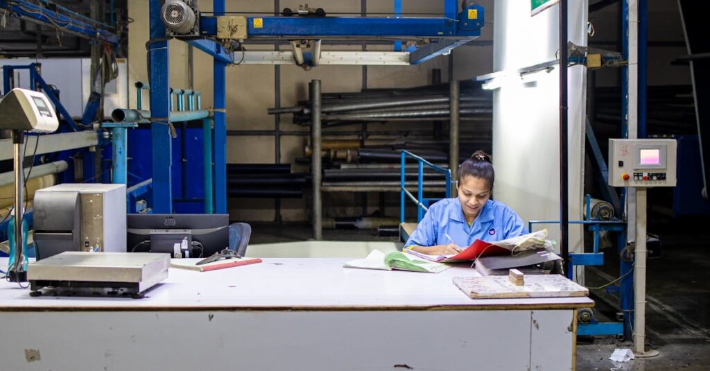
Let me tell you about Ananya. She’s 28, a procurement officer for a new chain of private schools in Hyderabad. Her first big order was for 20,000 custom notebooks. She found a supplier online who offered a killer price. The design proof looked great on her screen — vibrant, modern.
The shipment arrived. The colors were dull. Washed out. The lamination felt thin, almost filmy. But the real kicker? The school’s mascot, a detailed lion, was just a blurry orange blob. The fine lines had disappeared in the print. She had to face her principal. She had to explain to teachers why the books looked, in her own word, “tired.” The supplier blamed her file resolution. She blamed herself.
The problem wasn’t the design file. It was the manufacturer’s process. They were using lower-grade inks and a printing plate not suited for that level of detail on that paper stock. They cut the corner she couldn’t see. Now she works with manufacturers who send physical mock-ups first. Always.
Anyway. The point is, the screen lies. A PDF is a fantasy. You only know the cover when you hold it.
How to Talk to a Manufacturer About Cover Design (Without Sounding Clueless)
This is the part most people struggle with. You’re not a print expert. You shouldn’t have to be. But knowing a few key terms can save you a world of pain. It shifts the conversation from “make it look nice” to something actionable.
First, ask about GSM of the cover paper/board. For standard school notebooks, 250-300 GSM art card is common. For a corporate diary, you might go 400 GSM or higher. Thicker isn’t always better — it affects binding and cost — but it’s a starting point.
Second, specify the lamination type. Matte lamination (no shine, hides fingerprints) or gloss lamination (vibrant colors, shiny). There’s also soft-touch lamination, which feels… expensive. It’s a premium add-on but makes a huge difference in feel.
Third, and this is critical, ask for a physical dummy or mock-up before approving the full print run. Any manufacturer worth their salt will do this. It lets you check the feel, the weight, the color matching under real light, the binding alignment. If they refuse, walk away. Seriously.
Finally, be clear about who owns the design liability. If you supply the artwork, you’re responsible for its print-readiness. If you want them to design it, understand the revision process and costs. A good partner will guide you through this, not just take orders.
The Binding Dictates the Design (And Nobody Tells You This)
You can’t just slap any design on any binding. The mechanics of how the notebook is put together creates limitations and opportunities.
- Perfect Binding (glued spine, like a paperback): Gives you a clean, full-spine area for title/logo. Great for corporate diaries. Design can flow seamlessly across the front and back. But — the cover needs to be flexible enough to open without cracking the glue.
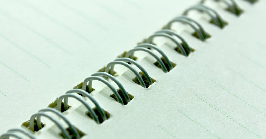
- Spiral/Wire-O Binding: The spiral punches through the cover. So your design needs a “safe zone” away from the punching area. You can’t put critical text or a logo right on the spine edge because it’ll get a hole through it.
- Saddle-Stitched Binding (stapled through the center): Common for thinner notebooks. The cover is folded, so the design needs to account for the spine fold. Colors and patterns need to align.
This is technical, I know. But it’s the reason a beautiful, centered logo ends up half-punched by a spiral coil. A professional manufacturer will template this for you. A cheap one will just print your file and hope for the best.
Right. So you’ve got the design, the material, the binding sorted. What happens when you need 100,000 of them next month?
Scale Changes Everything: Design for Manufacturing
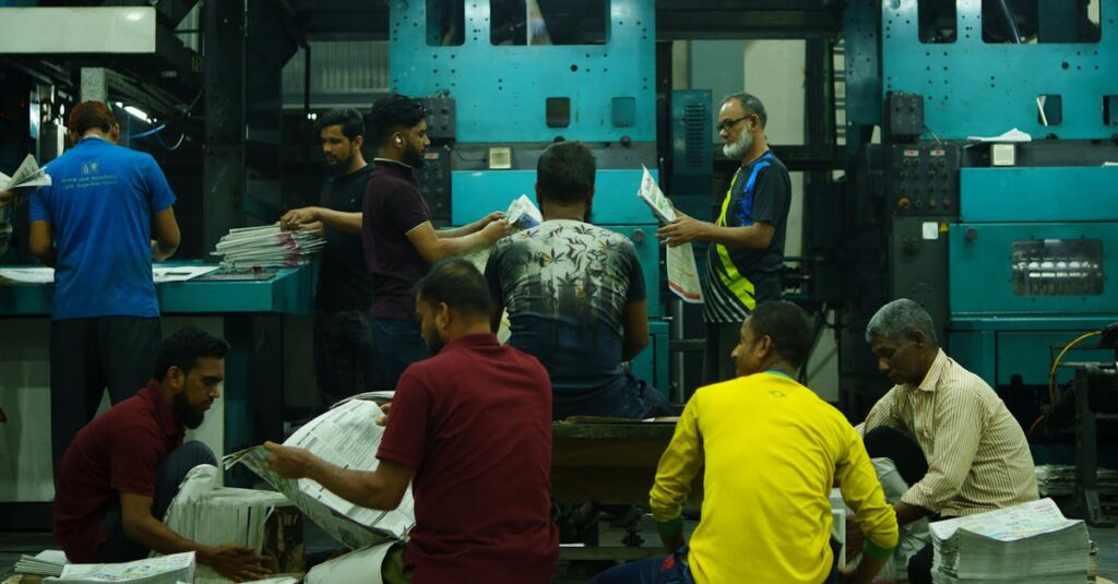
Designing one beautiful notebook is an art. Manufacturing 100,000 identical ones is a brutal science. This is where the romance of design meets the reality of rollers, inks, and conveyor belts.
The most elegant, intricate design with 15 subtle colors will be a nightmare to print consistently across a large batch. It will slow the line down. It will increase waste. And that cost will be passed on to you, or quality will suffer. Simplicity is scalable. Complexity is expensive and risky.
Think in terms of print plates and color stations. Standard offset printing might have 4 or 5 color stations. Every extra spot color or special finish (like a spot UV varnish) means another pass through the machine. More time. More potential for misalignment.
I think about this a lot. Clients often want “something unique.” And they should! But the smartest clients work with the manufacturing constraints to create something unique that also runs smoothly on a press. A bold, two-color design on a great paper stock with a textured finish can look more premium than a messy, full-color photo that’s poorly printed. It’s a partnership.
Your manufacturer should be able to tell you, “This part of your design might cause registration issues,” or “We can achieve a similar effect more reliably this way.” If they just say yes to everything, be nervous.
Frequently Asked Questions
What’s the most durable cover for school notebooks?
For everyday school use, you can’t beat a thick, coated duplex board with full gloss or matte lamination. The lamination is key — it seals the printed surface from water, dirt, and abrasion. It’s the workhorse of the industry for a reason. Avoid uncoated or un-laminated covers for bulk school orders; they’ll look tattered in weeks.
How do I ensure my logo prints correctly on the cover?
Supply your logo in a vector format (like .AI or .EPS). This means it can be scaled to any size without getting blurry. Also, talk to your manufacturer about color matching — provide Pantone (PMS) codes if you have them. Most importantly, always, always approve a physical print proof before the full run starts.
What’s the difference between matte and gloss lamination?
Gloss lamination makes colors pop and gives a shiny, protective finish. Matte lamination is non-reflective, feels smoother, and hides fingerprints better. Matte often looks more “premium,” but gloss can make brighter educational designs more vibrant. It’s a trade-off between look and feel.
Can I get a custom-shaped or die-cut notebook cover?
Yes, but it’s a specialized process called die-cutting. It involves creating a custom metal die to cut the paper into a unique shape. This adds significant cost and time, especially for bulk orders. It’s fantastic for a high-impact corporate gift but usually overkill for standard bulk educational or office notebooks.
How long does it take to produce custom cover designs in bulk?
It depends on the complexity. After final design approval, expect 2-3 weeks for standard laminated covers on a bulk order (say, 10,000+ units). This includes plate making, print setup, production, and binding. More complex finishes like foil stamping or embossing add more time. Always build in buffer time for mock-ups and proofs.
The Bottom Line on Notebook Cover Design
At the end of the day — and I mean this — a notebook cover is a piece of communication. It communicates value before a single page is turned. For you, the buyer, the goal isn’t to create art. It’s to create a cover that fulfills its job perfectly: protecting the contents, representing the brand (whether that’s a company or a school), and surviving its intended life.
The best cover design is the one you don’t have to think about again after you place the order. It arrives exactly as you envisioned. It holds up. It does its job. That outcome doesn’t come from a fancy design tool; it comes from clear communication with a manufacturer who knows how to translate a vision into thousands of identical, durable objects.
I don’t have a cleaner way to put it than that. It’s about trust, translated into cardboard and ink. If you’re looking at a big order and want to talk it through with someone who’s been in the print for four decades, that’s a conversation we can have.