Okay, here’s a thing that happens all the time, and nobody really talks about it.
You’re scrolling through supplier websites, looking to place a bulk order of notebooks for your school, your corporate offices, maybe for a distributor catalog. You’ve got a budget, you know the specs — A4, 200 pages, spiral bound. You click. And what do you see? A blurry picture. Taken on a dim desk. One corner of the notebook is folded over. You can’t tell if the cover is matte or glossy. The paper quality? No clue. It looks cheap. And in about three seconds, you’ve clicked away.
That’s the power of a photo of a notebook. For corporate buyers, wholesalers, anyone ordering in bulk — it’s the first handshake. It’s the quality check you can’t physically do from 500 miles away. If the photo is bad, you assume the product is bad. It’s that simple. And honestly? You’re probably right.
We’ve been making notebooks since 1985, and I’ve seen thousands of product photos — good, bad, and truly awful. The difference between a photo that wins a tender and one that gets instantly deleted isn’t just about a fancy camera. It’s about showing someone exactly what they’re buying. If you’re trying to judge quality from a distance, this is where you start.
Why a “Bad” Notebook Photo Costs You the Order
Let me get straight to the point. A bad photo screams amateur hour. And when you’re spending lakhs on a supply order, you don’t want to work with amateurs.
Think about the person on the other side of the screen. A procurement manager for a chain of schools. They’re not buying one pretty journal for themselves. They’re buying 5,000 units that need to survive a school year. Their job is on the line. They’re looking at your photo of a notebook and asking silent, desperate questions:
- Is the binding tight, or will pages fall out in a month?
- Is the cover flimsy cardstock or something that can handle a backpack?
- Is the paper so thin that ink bleeds through?
- Does the print look crisp, or is it smudged and off-register?
A low-resolution, poorly lit photo answers all those questions with a resounding “YES, IT’S PROBABLY TERRIBLE.”
Right? It makes complete sense.
The worst part is, the notebook itself might be perfectly fine. But you’ll never know, because the photo failed its one job: to build trust before a single word is read. You sell with the image before you sell with the spec sheet.
The Anatomy of a “Good” Notebook Photo (It’s Not Just Pretty)
So, what are you actually looking for? It’s not art. It’s evidence.
I was talking to a stationery distributor from Hyderabad last month — over a very quick phone call, he was rushing between meetings — and he said something that stuck. “I don’t need a photo that looks like it’s in a magazine. I need a photo that answers the five questions my retail clients are going to ask me.” He’s right.
Here’s what a truly useful photo of a notebook shows:
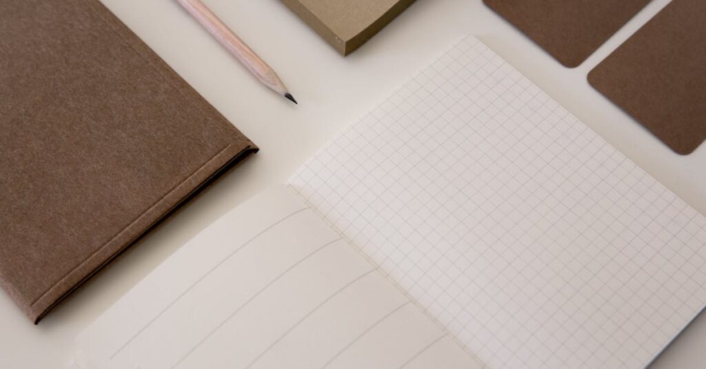
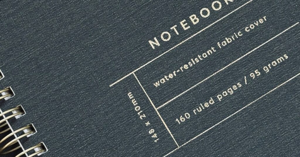
1. The Cover, Straight-On and in Context
Not angled all artistically. Straight on. Good, even light so you can see the finish. Is it laminated? Is it matte? Can you see the texture of the material? This tells you about durability and perceived value immediately.
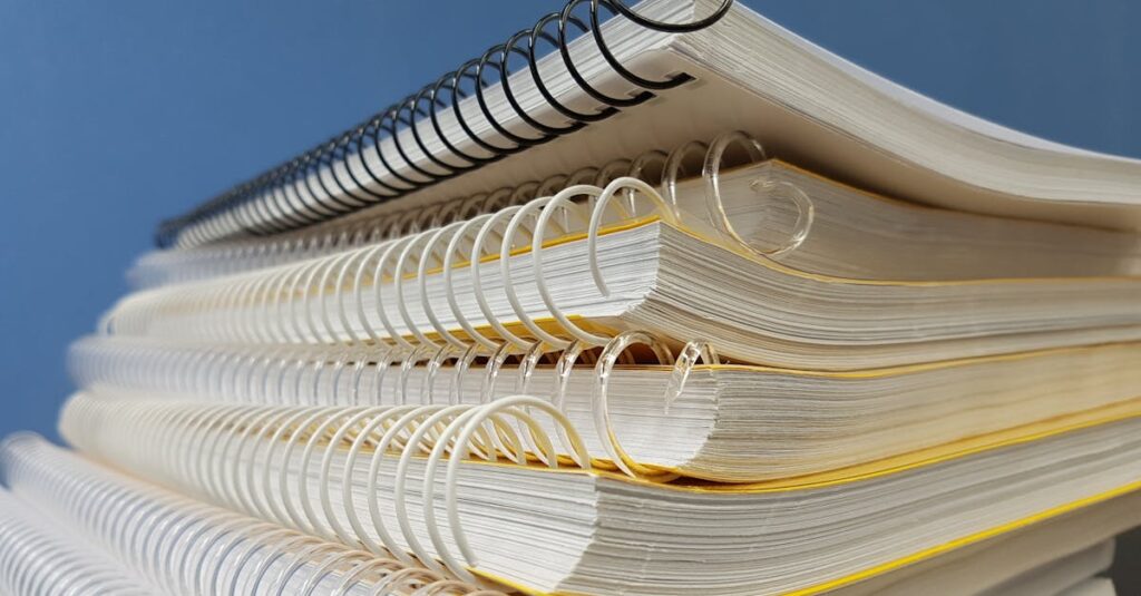
2. The Binding, in Action
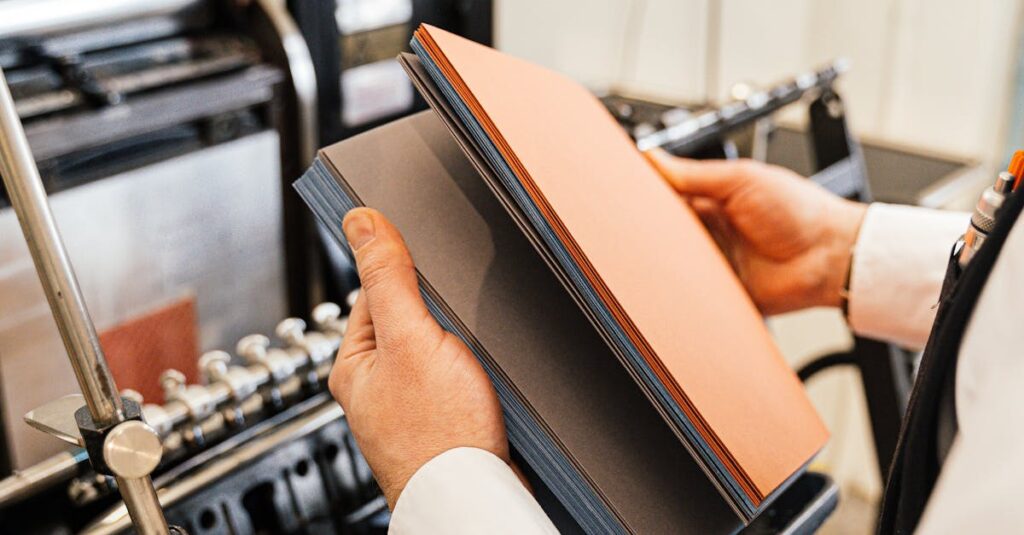
This is huge. A close-up of the spine. For a spiral-bound book, show the coil. Are the spirals tightly closed? Is the wire gauge thick? For a stitched or perfect-bound book, show the glue line. Is it clean? This single shot tells you more about longevity than a paragraph of text.
3. The Paper Quality (The “Bleed Test”)
This is the expert move. One photo should show an open spread. And on that spread, there should be writing. A pen. Maybe a highlighter. You need to see if the ink feathers. You need to see the show-through from the other side. A manufacturer confident in their 70+ GSM paper will show you it can handle a gel pen. One who isn’t, won’t.
And the ruling! If it’s a ruled notebook, the lines need to be sharp and consistent from edge to edge. A blurry photo hides misaligned printing. A sharp one exposes it.
The Micro-Story: Why the Photo Failed
Let me tell you about Priya. She’s 42, a procurement officer for a mid-sized IT company in Bangalore, ordering 1,000 custom diaries for the new year. She found a supplier with a decent quote. The website had a photo of the diary. It was on a wooden table with a cup of coffee. Very “lifestyle.” But she couldn’t see the gold foil stamp of the logo clearly. She couldn’t judge the shade of the leatherette cover. Was it burgundy or maroon? The spec sheet said one thing, the photo whispered another. She spent 20 minutes trying to zoom in, got pixelated nonsense, and finally gave up. She went with a supplier whose photo was boring — just the diary, on a white background, with three clear shots: closed, open, and a close-up of the stamped logo. It was an easy decision. The boring photo answered her questions. The pretty one just created more.
That’s the reality.
Stock Photo vs. Real Manufacturing Photo: A Side-by-Side Look
| What You’re Looking At | Generic Stock Photo | Real Manufacturer’s Photo |
|---|---|---|
| Purpose | To look attractive and set a mood. | To provide visual specification and proof of quality. |
| Lighting | Often dramatic, with shadows for “effect.” | Clean, even, and bright to eliminate shadows and show true color. |
| Detail Focus | On the overall scene (hands, coffee, decor). | On critical product details (binding, paper texture, print clarity). |
| Usefulness for Bulk Buyers | Low. It’s marketing fluff. | Extremely high. It’s a technical document. |
| What It Says About the Supplier | They care about aesthetics. | They understand a buyer’s practical concerns and have nothing to hide. |
See the difference? One is decoration. The other is communication.
Expert Insight
I was reading something last month — an old industry publication, actually — and one line from a packaging designer hit me. She said, “For B2B, your product photography isn’t a gallery. It’s a courtroom. Every image is evidence presented to the jury of procurement.” I keep thinking about that. It’s not about making the notebook look beautiful. It’s about making it look reliable. It’s about pre-answering the objections. The most valuable photo we ever took wasn’t the glossy one for the homepage. It was a simple, top-down shot of a notebook opened to the middle, with a heavy hand resting on one page, showing zero crease or tear in the paper. That single image did more to convince a government tender committee than our entire 10-page capability document. Don’t quote me on that being a universal truth, but in my experience? It’s pretty close.
How to “Read” a Notebook Photo Like a Pro Buyer
So next time you’re evaluating a supplier, don’t just glance. Investigate. Here’s what I do, and what I tell our own clients to look for on our site:
- Zoom in on the corners. Are they sharp and intact, or are they blunted and frayed? This hints at the quality of the cutting and trimming process in the factory.
- Follow the line of the spine. Is it straight? For a perfect-bound book, is there any buckling or waviness? That can mean poor glue application or improper drying.
- Look at the edges of the pages (the “trim”). Are they clean and uniform, or can you see loose fibers and dust? A clean trim means sharper blades and better machinery.
- Check the alignment of any printed cover design or ruling. Is the logo centered? Do the ruled lines run perfectly parallel to the edge? Misalignment is the hallmark of careless printing.
If a manufacturer’s photos pass this four-point check, you’re probably looking at a professional operation. If the photos are too small or fuzzy to even attempt this, walk away. Your time is better spent with someone who shows you the details.
Frequently Asked Questions
Frequently Asked Questions
Why can’t I just trust the product specifications sheet?
You should! The spec sheet is the contract. But the photo of the notebook is the proof that the contract is being fulfilled. “70 GSM paper” is a number. A sharp photo showing crisp, bleed-free writing on that paper is the evidence. One backs up the other. Never rely on just one.
I see many notebook suppliers using the same generic images. Is that a red flag?
It’s a big orange flag, for sure. It usually means they’re resellers, not actual manufacturers. They’re sourcing from a factory (maybe several) and using the factory’s stock photos. This can lead to inconsistency in your bulk orders. A true manufacturer will have unique photos of their own specific products, often in their own factory or warehouse.
What should a photo of a custom or private label notebook show?
Beyond the standard quality shots, it must show a perfect, high-resolution close-up of your custom printing. Logo, text, any special colors. The photo needs to prove the print registration is sharp, the colors match your brand guide, and the finish (foil, emboss, UV) is applied correctly. This is non-negotiable for brand consistency.
Are videos better than photos for evaluating notebooks?
For certain things, absolutely. A short video showing someone flipping through the pages smoothly (testing the binding) or bending the cover back (testing its flexibility) can be incredibly convincing. It shows dynamic performance a static image can’t. Look for suppliers who use both.
As a buyer, can I request specific photos before placing a large order?
You not only can, you should. Any reputable manufacturer will happily take a few extra photos to secure a large bulk or custom order. Ask for a specific shot of the binding, the inside margin, or the paper with a specific pen type you plan to use. Their willingness and speed in providing this is a great test of their customer service.
Look, It Comes Down to This
In the end, a photo of a notebook is a transparency tool. It either builds a bridge of trust or it burns it down before you even get started. For schools, corporates, wholesalers — your risk is high. Your need for reliability is absolute.
The notebook might be a simple object. But the decision to buy ten thousand of them isn’t. That grainy, poorly lit image isn’t just a bad photo. It’s a warning. And the clean, detailed, almost boringly straightforward shot? That’s a handshake. It’s someone saying, “We know what you need to see, and we’re not afraid to show it.”
I don’t think there’s one perfect way to photograph a product. Probably there isn’t. But if you’ve read this far, you’re not just looking for a picture. You’re looking for proof. And you deserve to see it, clearly.
Maybe start by seeing what that clarity looks like from our side.