
Here’s something nobody in the corporate procurement meeting will tell you: they’re terrified of screwing up the notebook order.
I’ve seen it a hundred times. A procurement manager gets handed a logo file and told to get notebooks for the whole company. They know it’s about the brand image — that little booklet sits on a desk for months, maybe years. They want it to look sharp, to feel premium. But they have zero idea what makes a good notebook cover design, technically speaking. They’re not designers. They’re buyers. And they’re scared of ordering 5,000 units of something that looks cheap or falls apart. If you’re in that position right now, wondering if you’re about to make an expensive mistake, this might be where to start looking.
Why the Cover Isn’t Just a Pretty Face
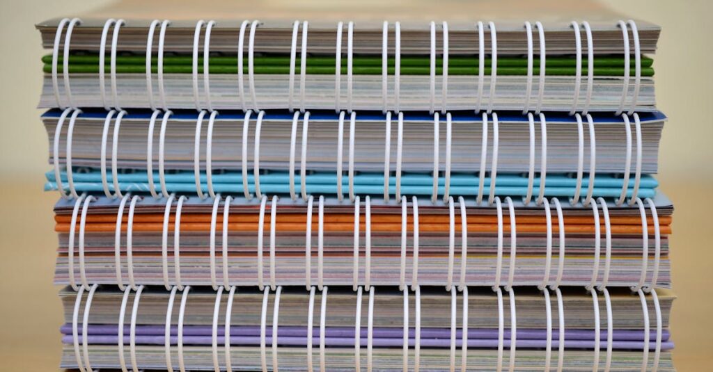
Most people think of a notebook cover as decoration. It’s not. It’s the first thing your hand touches. It’s the thing that gets slid in and out of bags, thrown on desks, stacked in boxes. A cover is armor.
Think about it this way: you’re ordering notebooks for a school. Those things are going to live in kids’ backpacks for a year. They’ll get wet from a water bottle. They’ll get bent. They’ll get thrown. A flimsy cover glued on cheaply? It’ll be peeling by October. I’ve seen schools come back for re-orders mid-year because the covers disintegrated. It’s a waste of their money and a headache for everyone. The design isn’t just about the picture on the front; it’s about the material choice, the lamination, the binding edge, the thickness of the board. It’s engineering you hold in your hand.
And for corporate clients — it’s worse, honestly. The notebook is a walking billboard for their brand. A shoddy cover with a blurry logo screams “we don’t pay attention to detail.” It’s subconscious. A person gets a nice, crisp, well-made notebook with a clean logo, and they think, “This company has its stuff together.” The cover sets the tone before a single page is written on.
Anyway. Where was I. Right — what actually goes into it.
The Three Things Every Good Cover Design Needs (That Aren’t Art)
You can have the most beautiful artwork in the world. If you mess up these three things, the notebook feels wrong.
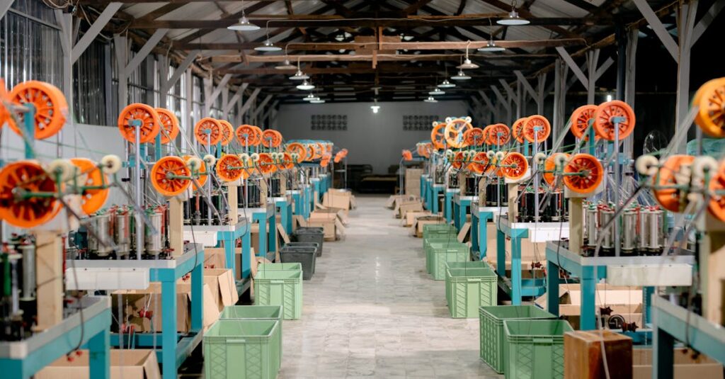
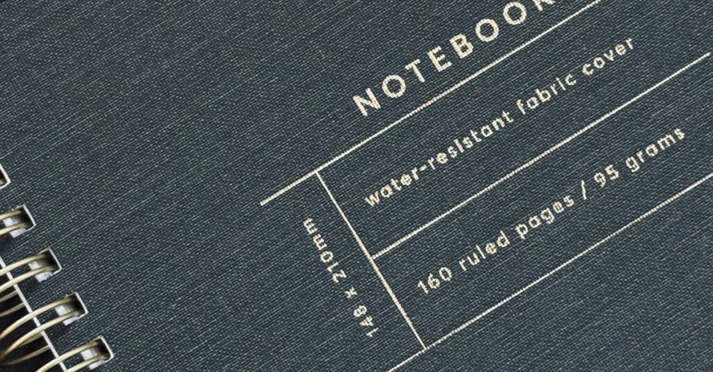
First: material. This is the base. Most standard notebooks use what’s called art card or grey board. The GSM (grams per square meter) matters here. Thicker isn’t always better — a 350 GSM board is stiff and durable, perfect for a corporate diary meant to last. A 250 GSM board is lighter, more flexible, and cheaper, which might be fine for a student exercise book. You need to match the material to the abuse it’ll take. A distributor ordering for a government tender needs something that can survive storage and rough handling. That’s a different material conversation than a boutique wanting fancy journals.
Second: lamination. This is the clear plastic layer over the printed paper. It protects the ink from smudging and the paper from moisture. You have gloss lamination (shiny, vibrant colors), matte lamination (smooth, professional, no glare), and soft-touch lamination (that velvety feel you get on high-end tech boxes). Gloss is common and cost-effective. But for a corporate notebook? I’d push you toward matte. It looks more expensive. It feels more substantial. It doesn’t show fingerprints. The right lamination changes everything.
Third: finishing. This is where you get fancy. Foil stamping for a metallic logo. Embossing to make the logo pop out. Spot UV to make certain parts glossy on a matte cover. These are the details that turn a commodity into a branded asset. They cost more. But for a company giving these to clients or top executives, it’s worth every rupee. The tactile experience is part of the message.
So you see — the “design” starts long before the graphic designer opens their software. It starts with a conversation about what this notebook’s life will be.
A Quick Story From Last Month
I was talking to a procurement manager from a tech company in Hyderabad. Let’s call him Ravi. He’s 42, handles all their swag. He showed me last year’s notebook. Nice logo, but the cover was thin, the corners were already dog-eared on the samples. “They feel disposable,” he said. “We don’t want to give our clients something that feels disposable.” He wasn’t upset about the price. He was upset about the feeling. We ended up switching to a heavier board with a matte laminate and a slightly rounded corner stitch. The cost went up by maybe 8%. He didn’t blink. Because the problem wasn’t money. It was pride.
People forget that. They think bulk buyers only care about the lowest price per unit. Sometimes. But often, they care about not looking bad to their own bosses or their customers. The cover is the most visible proof of their choice.
Matte vs. Gloss Lamination: The Real-World Showdown
This is the single biggest choice you’ll make that affects look and feel. Let’s break it down, not with marketing fluff, but with what actually happens on a desk.
| Feature | Matte Lamination | Gloss Lamination |
|---|---|---|
| Look & Vibe | Professional, premium, understated. Colors are deep but not shiny. | Vibrant, eye-catching, commercial. Colors “pop” more. |
| Durability | Hides scratches and scuffs incredibly well. Looks new longer. | Shows every fingerprint and minor scratch. Can look worn quickly. |
| Writing Surface | Non-reflective. You can write on it easily with a pen if needed (for labeling). | Reflective and slippery. Hard to write on. |
| Cost Implication | Slightly more expensive than gloss, typically. | The standard, most cost-effective option. |
| Best For | Corporate gifts, executive diaries, brand-sensitive materials, any setting with overhead lights. | School notebooks, promotional giveaways, products where color impact is key. |
| The Feel | Smooth, almost silky. Feels expensive to the touch. | Slick and plastic-like. Feels functional. |
My rule of thumb? If the notebook is a reflection of your company’s brand, go matte. If it’s a consumable item for mass distribution, gloss is perfectly fine and will save you money. The question isn’t which is better. It’s what are you trying to say?
Common Mistakes (And How to Avoid Them)
Look, I’ll be direct. We see the same errors on files sent to us for printing every single week. Avoiding these will put you ahead of 90% of buyers.
- Low-Resolution Logos: You cannot take your website’s tiny logo and blow it up for a notebook cover. It will be pixelated and blurry. You need a vector file (AI, EPS, PDF) or a high-resolution image (300 DPI at the print size). This is the number one cause of “it looked good on my screen but printed badly.”
- Ignoring the Bleed: This is a printing term. If you want color to go right to the edge of the cover, your design file needs extra background color (usually 3mm) that gets trimmed off. If you don’t provide this, you’ll get a thin white border around the edge. It looks amateur.
- Designing in RGB: Screens use RGB color mode. Printers use CMYK. Reds and blues can shift dramatically. Always convert your design to CMYK before sending it. A good manufacturer will check this, but don’t rely on it.
- Forgetting the Spine: For thicker notebooks (200 pages+), the spine is visible. Are you leaving it blank? Putting the logo on it? Repeating the front design? It’s a small detail that gets missed constantly.
And honestly? The biggest mistake is not asking for a physical proof. Never, ever approve a mass order based on a PDF on your laptop. A digital proof shows color. A physical proof shows feel, weight, binding, and how the ink actually sits on the laminated paper. It’s the only way to be sure. Any supplier worth dealing with will provide one for a custom job.
Expert Insight
I was reading something last month and one line stuck with me. A packaging designer said the goal of a cover isn’t to be noticed first — it’s to be remembered last. It’s the feeling left in someone’s hands after they put the notebook down. I think about that a lot in our factory. We can make it bright and loud. But making it feel substantial, making the binding lie flat, making the cover have just the right amount of flex… that’s what makes someone pick it up again tomorrow. It’s not magic. It’s just paying attention to the things most people rush past.
What Bulk Buyers Should Ask Their Supplier
If you’re ordering 1,000, 5,000, 10,000 notebooks, you’re not just buying a product. You’re buying a capability. Your questions should reflect that.
- “Can I see samples of your standard cover materials?” Don’t just look at pictures. Feel them. Bend them. Try to peel the laminate.
- “What’s your process for color matching my brand colors?” Do they use Pantone codes? Do they do a press check? A vague answer here is a red flag.
- “What happens if there’s a defect in the production run?” Are they replacing entire batches? What’s their quality control process on the line? A good manufacturer will have one and explain it.
- “What’s the lead time from approved proof to delivery?” And be wary of anyone who promises something drastically faster than everyone else. Quality printing and binding takes time. Rushing leads to errors.
I’ve heard procurement managers say they feel like they’re at the mercy of the supplier’s jargon. You’re not. You’re the client. A good partner will explain this stuff in plain language, because they want you to be confident in the order. If they can’t or won’t, walk away. There are plenty of us who’ve been doing this for decades and remember that our job is to solve your problem, not confuse you.
Frequently Asked Questions
What file format is best for sending my notebook cover design?
Always send a print-ready PDF with fonts embedded, or the original Adobe Illustrator (AI) file. Include all linked images. For the logo itself, a vector file (EPS, AI, or PDF) is mandatory. JPEGs or PNGs from your website will not work for high-quality printing.
How much does custom notebook cover design cost?
It depends completely on the complexity. Simple one-color logo stamping is cheap. Full-color photographic covers with special finishes (foil, embossing) cost more. The real cost is in the setup for printing. For bulk orders (1,000+), this setup cost gets spread out and becomes negligible per notebook. Always ask for a quote based on your exact quantity and specs.
Can you help me design a cover if I don’t have a graphic designer?
Yes, most established manufacturers like us have basic design services. We can take your logo, brand colors, and text and create a clean, professional layout for you to approve. For very complex or artistic designs, we’d recommend working with a designer, but we can handle standard corporate or school cover designs in-house.
What’s the minimum order quantity (MOQ) for custom cover notebooks?
This varies. For a manufacturer with large presses, the MOQ is usually around 500 to 1,000 pieces to make the custom plate setup worthwhile. For digital printing, MOQs can be lower (100-250), but the per-unit cost is higher. Be clear about your quantity when asking for quotes.
How long does it take to produce notebooks with custom covers?
From final approved artwork, allow 3-5 weeks for a standard bulk order. This includes time for proofing, plate making, printing, binding, and quality checks. Rushed projects are possible but can incur extra charges and carry a higher risk of errors. Plan ahead if you can.
So, what’s the main thing to remember? The cover of a notebook is a decision, not a decoration. It’s a decision about durability, about brand perception, about the silent message you’re sending to the person who uses it. You can get it cheap and fast. Or you can get it right.
I don’t think there’s one perfect answer for every order. Probably there isn’t. But if you’ve read this far, you’re not just looking for a product — you’re looking for a partner who won’t let that decision blow up in your face. You’re figuring out who you can trust with that little piece of your brand’s reputation. And honestly, that’s the whole job.
If the idea of getting this right without the headache sounds good, it might be worth having a conversation. We’ve been having them since 1985.