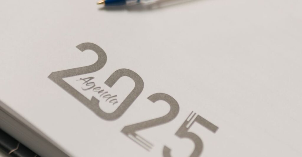
Look, I get it. You’re ordering corporate diaries or school notebooks in bulk, and you see this term – upset printing. Probably from a manufacturer’s site, maybe from a quote. And you’re thinking… “What does that even mean? Is it a misprint? An angry printer?”
I’ve had this exact conversation with procurement managers, school principals, you name it, for about… well, let’s just say a lot of years. You’re comparing quotes, trying to get the best product for your budget, and this industry jargon gets thrown at you. It’s not explained. It’s frustrating, right? You shouldn’t need a dictionary to buy notebooks.
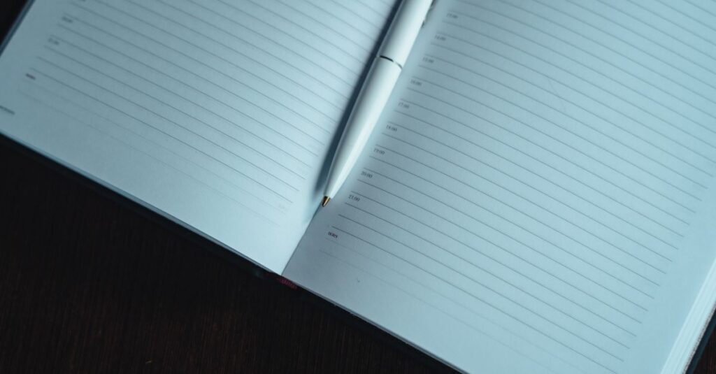
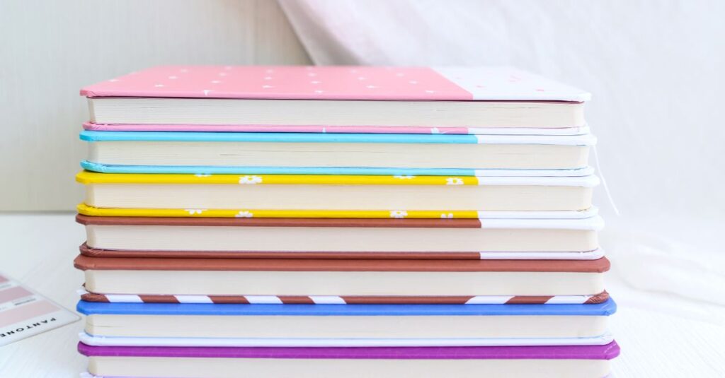
So let’s clear it up. Upset printing isn’t a mistake. It’s the process of printing on the three outer edges of a notebook’s pages. The head, the tail, and the fore-edge. That colored or gilded edge you see on high-end diaries? That’s upset printing. That school logo you want stamped on the side of a stack of 5,000 notebooks? Also upset printing.
And the reason you’re here isn’t just to get a definition. You need to know if you should ask for it, how much it adds, and whether it’s worth the hassle for your bulk order. If that sounds like where you’re at, you’re in the right place. Understanding the printing options is half the battle of getting a product that actually looks the part.
Upset Printing Explained: It’s All About the Edge
Forget the word “upset.” In binding and printing, it’s got nothing to do with mood. Think of it more like “setting up” the edge for decoration. The core idea is shockingly simple: you take a perfectly bound, trimmed block of paper — the text block, before it gets a cover — and you apply ink, foil, or even a protective coat directly to its sides.
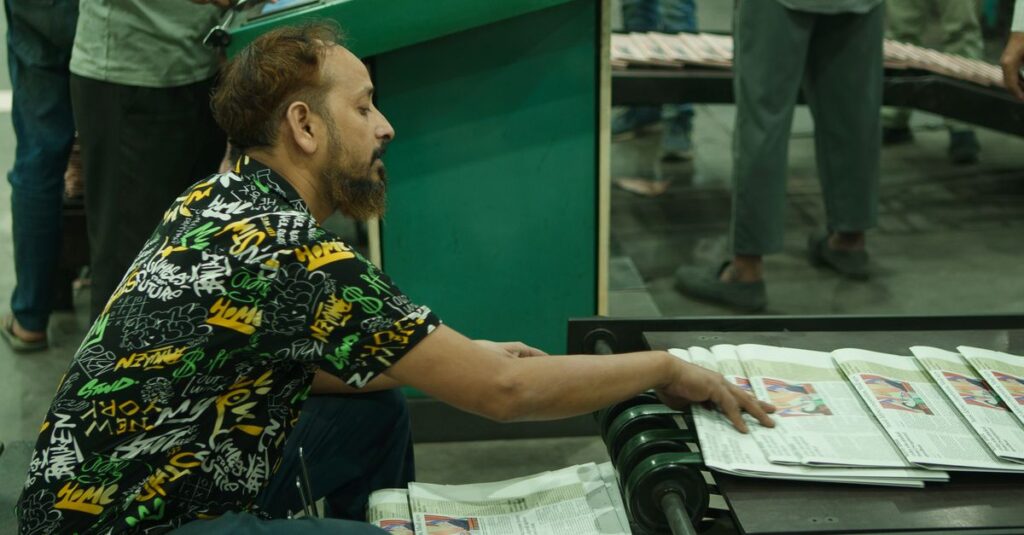
The machine clamps the block tight and runs a roller or applicator across the edge. It’s a separate, specialized step. This isn’t done on single sheets; it’s done on the finished, solid block. That’s why it’s a premium add-on. It needs extra time, a separate machine setup, and often a second pass through the factory floor.
Three main types you’ll hear about:
- Colour Edge Staining: This is the classic. You’re literally painting the edges. It gives a solid, uniform block of colour. Deep blues, corporate reds, school greens. It’s durable and clean.
- Foil Edging: Metallic finish. Gold, silver, copper. You see this on award books, premium corporate diaries, legal pads. It shouts (or at least speaks firmly about) quality.
- Printed Edging: This is the tricky one. Actually printing a logo, pattern, or text on the edge. The paper needs to be perfectly aligned, the printing precise. It’s less common for bulk school books but a killer feature for branded corporate gifts.
And here’s the thing nobody tells you upfront: the paper quality matters. A lot. Cheap, dusty paper will absorb ink unevenly. A smooth, high-GSM paper takes the colour or foil beautifully. You’re not just paying for the ink; you’re paying for the base material that makes the ink look good.
Why Bother? The Real-World Use Cases
Okay, so you can paint the side of a notebook. Big deal. Why would you?
Let me tell you about a client from Hyderabad — a mid-sized tech firm. They ordered 1,000 executive diaries for client gifts. Standard cover, decent paper. Nice. They came back the next year and asked for upset printing in their brand blue on the edges. The cost went up by maybe 8%. The perception of the diary? It transformed. It went from a “nice notebook” to a “branded artifact.” Clients noticed. They commented. That edge colour made the diary sit differently on a desk. It felt cohesive. Intentional.
That’s the power of it. It’s a subtle, almost subconscious signal of completeness and attention to detail.
Where It Actually Makes Sense:
- Corporate Branding & Gifts: This is the #1 use. Diaries, planners, notepads for clients, partners, or top-tier employees. The edge colour matches the logo. It turns stationery into a brand extension.
- Institutional Identity: Think universities, elite schools, government ministries. A specific colour on the edge of all official record books or student notebooks creates a strong, unified institutional identity. It says “This is ours.”
- Product Line Differentiation: You make 3 grades of account books. Standard has white edges. Premium has blue edge staining. Executive has gold foil. Instantly tiered. Instantly clear.
- Aesthetics & Perceived Value: Simply put, it looks more expensive. A solid black edge on a sketchbook? A rich maroon on a leather-bound journal? It adds a layer of finish that plain, cut paper edges just don’t have.
The flip side? For a basic school notebook order of 50,000 pieces where the priority is cost-per-unit and durability for rough use… it’s probably an unnecessary expense. The kids won’t care. The procurement committee will. Know your audience.
Upset Printing vs. The Alternatives: A Straight Comparison
When you’re specifying a job, you’ll hear other terms. Let’s cut through the noise. Here’s how upset printing stacks up against other edge treatments you might consider.
| Feature | Upset Printing (Edge Staining/Foil) | Plain Cut Edges (No Treatment) | Coloured Paper (Through the sheet) |
|---|---|---|---|
| Cost Impact | Adds cost. Separate process, extra material (ink/foil). | Zero added cost. Standard finish. | High cost. Coloured paper is significantly more expensive than white. |
| Visual Effect | Solid colour block on edges only. White pages inside. | Natural, often slightly rough white/off-white paper edge. | Entire page is coloured, edge-to-edge. Affects writing surface. |
| Durability | Good. Stain soaks in; foil is laminated. Wears well. | N/A. It’s just paper. | Excellent. Colour is part of the sheet. |
| Best For | Premium branding, corporate gifts, tiered product lines. | Bulk school notebooks, internal office pads, cost-sensitive items. | Specialised uses like duplicate books, specific form colours. |
| Lead Time | Longer. Adds a production step. | Standard. | Can be longer if coloured paper isn’t in stock. |
The takeaway? Upset printing is for when you want the look of a fully coloured product without the cost and functional drawbacks of coloured paper throughout. It’s a targeted aesthetic upgrade.
Getting It Done Right: The Manufacturer’s Perspective
This is the part I wish every buyer knew before they sent an RFQ. I’m not just writing this; I’ve lived it on the factory floor. Upset printing isn’t a checkbox. It’s a conversation with your manufacturer.
Expert Insight
I was walking the line with our production head, Ramesh — he’s been here since ’92 — and we were looking at a batch of 10,000 navy-blue-edged diaries. The colour was perfect. He pointed at the clamp marks, tiny, almost invisible. “People think we just dunk it in paint,” he said. “The truth? It’s about pressure. Too little, the edge is patchy. Too much, you deform the block, and the cover won’t fit. And the ink viscosity on that day? That matters too.” He shrugged. “It’s a feel thing.” That stuck with me. You’re paying for that feel, for that experience in the hands of someone who knows the machine’s mood. There’s no software for that.
So, if you’re specifying this, here’s what you need to nail:
- Provide a Pantone or physical sample. Saying “royal blue” is a gamble. Give the exact colour code or a swatch. The difference between “gold” and “antique gold” foil is everything.
- Ask for edge samples on YOUR paper. A good manufacturer will run a small batch on your actual chosen paper stock and send you a dummy. Don’t approve from a generic swatch book. The result changes with paper density and finish.
- Understand the minimum order quantity (MOQ). Cleaning and setting up the edge printer is a pain. For a run of 200 diaries, the setup cost might double the unit price. It becomes economical at higher volumes, typically 1,000+ units depending on the complexity.
- Build in extra time. This isn’t a fast process. Add at least a few days, maybe a week, to your production schedule for edge treatment.
And a quick, honest aside: if you’re working on a razor-thin budget for a massive school tender, prioritize paper quality and binding durability over edge colour. A strong stitched binding that lasts the year is better than a pretty edge that chips off. Always.
Frequently Asked Questions
Is upset printing the same as gilding?
Yes and no. Gilding is a specific type of upset printing using metallic foil (like gold leaf). So all gilding is upset printing, but not all upset printing is gilding. You can have upset printing with plain coloured ink, which isn’t gilded.
Will the colour on the edge chip or rub off?
It shouldn’t if done properly. Quality edge staining uses dye-based inks that penetrate the paper fibers. Foil is laminated on. But cheap paint-on applications can rub off, especially on rough-edged paper. Always ask for a rub-test sample.
Can you print a logo on the notebook edge?
Technically yes, but it’s a highly specialized and expensive process. The text block needs to be fanned slightly and printed with precision equipment. It’s rare for standard bulk orders and more common for ultra-premium limited editions. For most brands, a coloured edge matching the logo is the practical choice.
Does upset printing affect how the notebook opens or lies flat?
It shouldn’t. A well-executed job applies minimal, even pressure. If too much glue or pressure is used, it can make the initial pages stick together slightly, but this is a sign of poor technique, not an inherent flaw.
Is it available for all binding types?
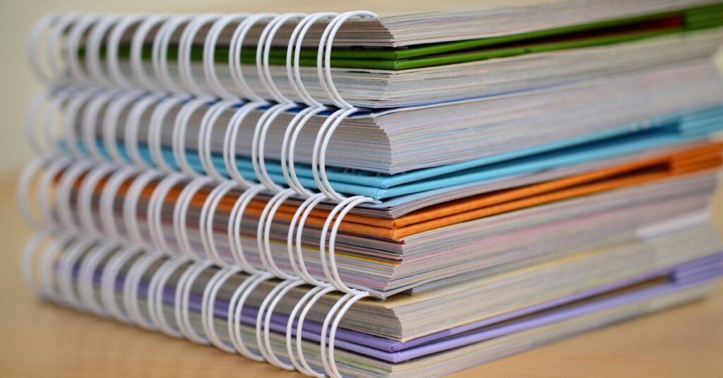
Best for perfect bound and section-sewn books that have a solid, square edge to print on. It’s very difficult on spiral or wire-o bound notebooks because the edges aren’t a continuous solid block — there are holes and gaps.
The Bottom Line on Upset Printing
So, what’s the verdict? Upset printing is a tool. A specific, slightly fancy tool for a specific job.
If you’re ordering a premium product where brand perception, gift-worthiness, and a finished aesthetic are non-negotiable, it’s worth the conversation and the extra cost. It’s the detail that completes the package. But if you’re supplying functional notebooks where durability and price are the driving factors, it’s an expense you can confidently skip.
The real skill isn’t in knowing what it is — it’s in knowing when to use it. I’ve seen companies waste money on it for the wrong product, and I’ve seen others miss a huge branding opportunity by overlooking it. The trick is to match the process to the purpose, not the other way around.
I don’t think there’s one answer here. Probably there isn’t. But if you’ve read this far, you’re not just buying notebooks — you’re thinking about what they represent. And that means you’re already asking the right questions. The next step is just figuring out which details matter for your project. Sometimes, a quick chat with someone who’s done it a thousand times is the fastest way to get clarity.