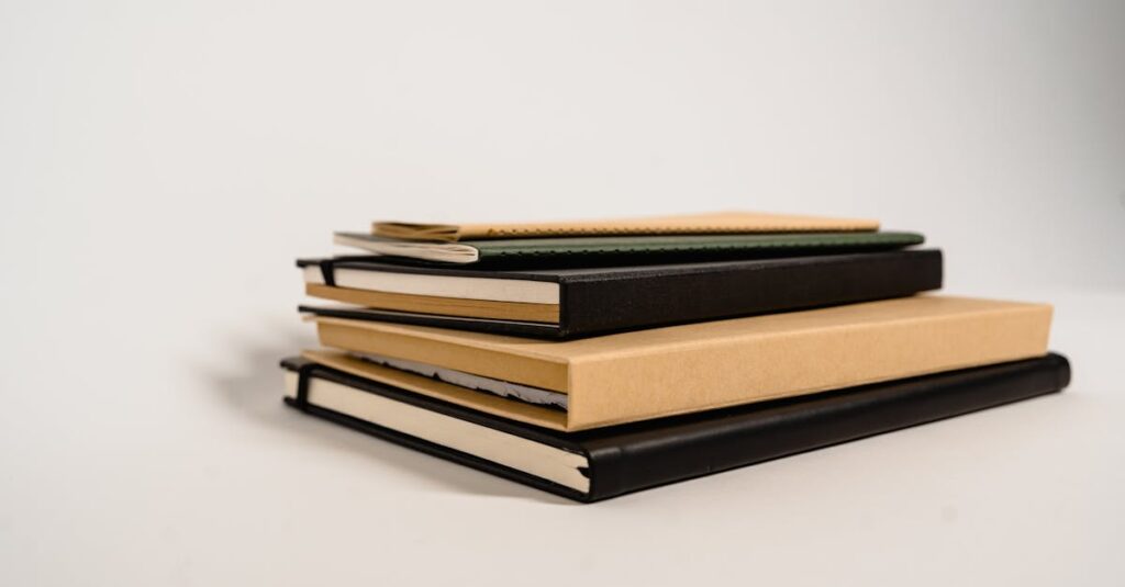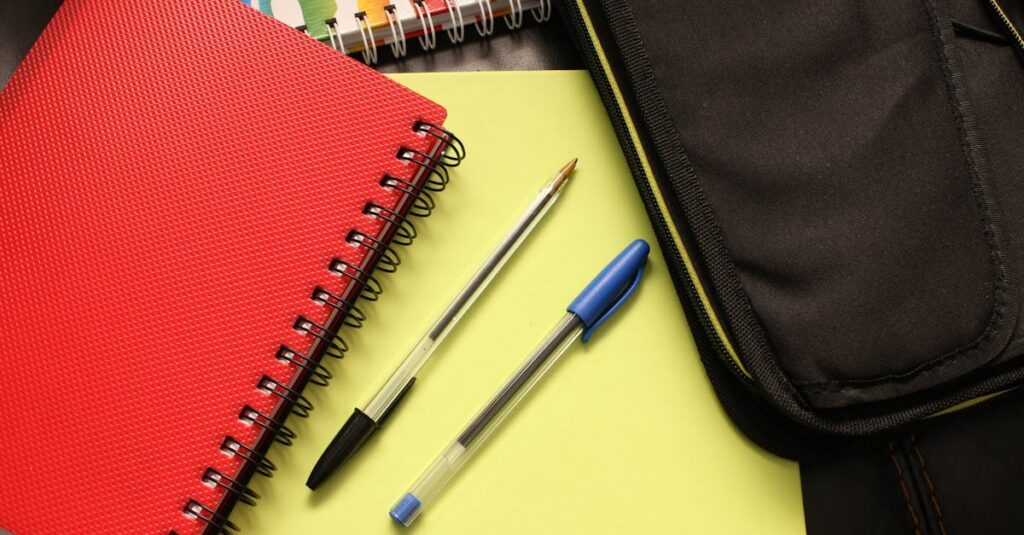
Why Your Notebook Pages Matter More Than You Think
Look, I’ve been in this business for a long time. Decades. And here’s the thing people get wrong about notebooks: they think the cover is what sells it. The glossy finish, the embossed logo. Sure, that’s the first impression. But what keeps a notebook in someone’s hands — what makes them pick it up day after day — is what’s inside. The pages.
I’ve watched procurement managers from big corporations flip through sample notebooks. Their eyes glaze over the cover. They’re not even looking at it. They’re pressing a pen to the paper. They’re checking the margin space. They’re counting the lines. They’re trying to figure out if their employees will use it or if it’ll end up in a drawer by February. The design of the pages isn’t just decoration. It’s the whole point of the tool.
If you’re buying notebooks in bulk for a school, a company, a whole government department, you’re not just buying paper. You’re buying productivity. You’re buying a system. And the system lives on the page. So how do you design that system? Where do you even start? It’s worth looking at what’s possible before you place an order that doesn’t fit.
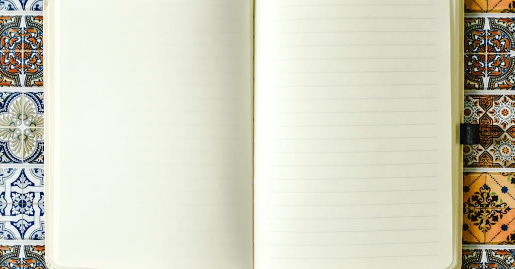
The Anatomy of a Notebook Page: It’s Not Just Lines
Let’s break it down. A page is a workspace. Every element on it has a job. And most off-the-shelf notebooks get this completely backwards. They assume one size — one single ruling type — fits every task. It doesn’t.
Think about a primary school student learning to write letters. They need broad, clear lines with a dashed center line to guide letter height. That’s a Center Broad Ruled (CBR) page. Now think about an accountant jotting down ledger entries. They need tight, double lines to separate debits and credits clearly. That’s Double Ruled (DR). An architect sketching a floor plan? They need a faint grid. That’s Cross Ruled (CR).
These aren’t just different patterns. They’re different tools for different brains. When you design pages, you’re designing for a specific kind of work. You’re deciding how much space someone needs to think. And most people I’ve spoken to — the ones placing orders for 5,000 notebooks — they don’t realize they have this choice. They just tick the box for “ruled” and move on. But the wrong ruling can make a notebook useless.
Meet Amit, 38, Procurement Head
Amit works for a tech startup in Hyderabad. Last year, he ordered 500 branded notebooks for the engineering team. Standard single-ruled pages. He thought it was a safe choice. He showed me one a few months later. The developers hadn’t written in it. They’d drawn flowcharts, boxes, arrows — all crammed into the narrow lines. The pages were a mess. “They said it felt restrictive,” he told me over the phone. “Like trying to code in a straight jacket.” He didn’t need fancy covers. He needed unruled or graph pages. A simple change. A huge difference in actual use.
Anyway. The ruling is just the skeleton. The paper is the skin.
Paper Weight & Quality: The Feel That Changes Everything
This is where cheap notebooks fail. Every time. They use paper so thin you can see the next page’s writing bleeding through. Or paper so rough it feels like you’re writing on sandpaper. The writing experience becomes a fight.
We standardize on around 54 GSM writing paper for most of our notebooks. Why? It’s a sweet spot. Thick enough that a fountain pen won’t bleed through, but not so thick that the notebook becomes a brick. It has a smooth finish — not glossy, not rough — that lets a pen glide. That’s the feeling you want. You don’t want the user to be aware of the paper. You want them to be aware of their thoughts.
And honestly? Most corporate buyers focus on page count. “Give me 240 pages!” they say. But 240 pages of bad 40 GSM paper is worse than 120 pages of good 54 GSM. It feels flimsy. It tears. It tells the user, “This is disposable.” Is that the message you want your company’s branded notebook to send?
The weight of the paper, the texture — it’s a silent communication about quality. People notice. They might not say it, but their hand knows. If the page feels good, they’ll keep writing. If it doesn’t, the notebook gets abandoned. Simple as that.
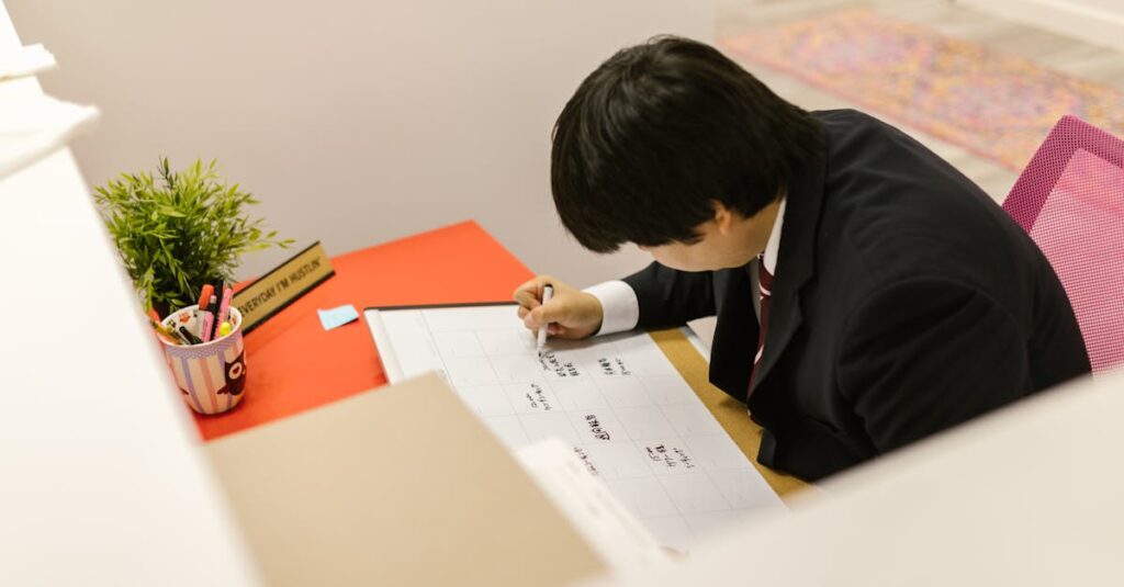
Custom Layouts for Corporate Branding: More Than Just a Logo
Here’s where it gets interesting for businesses. Custom page design. It’s not just slapping your logo in the corner. That’s the basic version. The real value is in designing the flow of the page to match how your company works.
I was talking to a client last week — a project management firm — and they had this brilliant idea. They wanted their custom diaries to have a weekly spread where the left page was a timeline grid (9 AM to 6 PM, Monday to Friday) and the right page was a blank, unruled space for notes and sketches. The left brain gets the schedule, the right brain gets the ideas. All on one spread. It’s a page layout designed for how their consultants actually think.
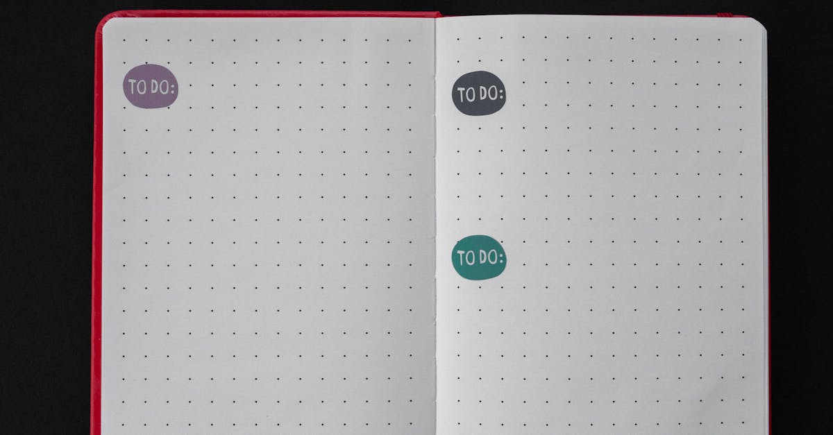
We see this a lot with schools, too. A custom notebook for a biology class might have unruled pages at the front for diagrams, followed by single-ruled pages for notes. Or a header printed on every page: “Date:” and “Topic:” So the student doesn’t have to waste time rewriting that structure every day.
These are functional customizations. They turn a generic notebook into a proprietary tool. They make the notebook belong to that school, that company. And from a manufacturing standpoint, it’s not as hard as people think. With digital and offset printing, we can run custom headers, footers, margin designs, even pre-printed sections. The question isn’t “Can it be done?” It’s “What would make this notebook indispensable for your team?”
That’s the conversation worth having with a manufacturer who gets it.
Expert Insight
I was reading an article about ergonomics and tools last month, and one line stuck with me. It said a well-designed tool “disappears” in the user’s hand. The hammer feels like an extension of the arm. The keyboard feels like a direct line from thought to screen. That’s what you’re aiming for with a notebook page. It shouldn’t be something the writer has to contend with. The lines should guide without shouting. The paper should accept ink without fuss. The layout should organize thought without imposing rigidity. The best page design is the one the user doesn’t notice at all — they only notice how much they got done. I don’t have a cleaner way to put it than that.
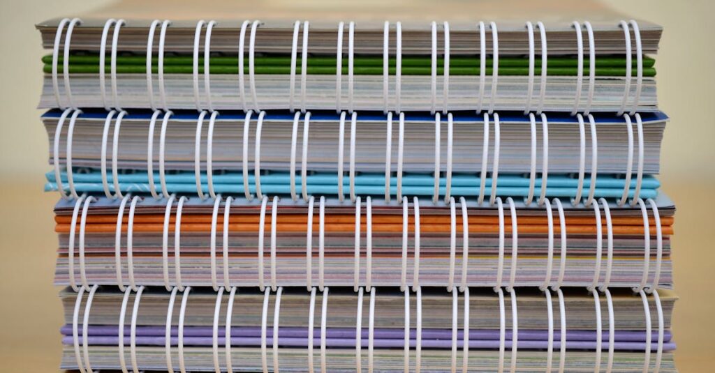
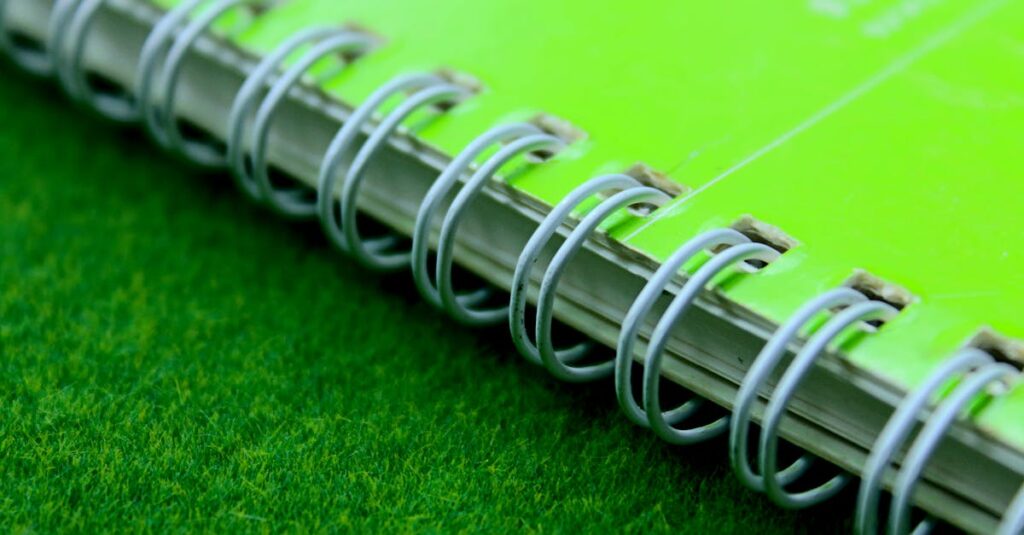
Choosing the Right Binding for Page Design
This one’s crucial, and it’s where people trip up. Your beautiful, custom-designed page means nothing if the notebook doesn’t open flat. If someone has to fight the spine to write near the gutter, they’ll stop using it.
So you have to match your page design to your binding. Here’s a quick breakdown:
- Spiral Binding (Wire-O or Plastic): The king of lay-flat functionality. Perfect for sketchbooks, music sheets, anything where the user needs 100% access to the page surface. Downside? It’s less “corporate” looking, and the spirals can get bent.
- Perfect Binding (like a paperback book): Looks sleek, professional. Great for corporate diaries and reports. But it has a tight gutter — the inner margin where the pages meet the spine. If you’re designing pages for perfect binding, you MUST leave a wider inner margin. Otherwise, text gets eaten by the spine.
- Stitched Binding (Saddle Stitched or Side Stitched): The classic school notebook. Durable, lies reasonably flat, cost-effective for bulk. This is the workhorse. For most standard ruled pages, this is the go-to. It’s predictable.
The binding isn’t an afterthought. It’s part of the page design spec. You can’t design a two-page spreadsheet spread for a perfect-bound book and expect it to work. It won’t. You have to think about how the book will be held, opened, and used. The binding is the hinge of the whole experience.
Notebook Page Design Comparison: Standard vs. Custom
| Aspect | Standard Off-the-Shelf Pages | Custom-Designed Pages |
|---|---|---|
| Ruling Type | Limited choice (usually Single or Unruled only). | Full choice (SR, DR, CR, FR, BR, OSR, CBR). You pick the tool. |
| Margins | Fixed, often narrow. One size fits none. | Adjustable. Wider gutters for binding, custom header/footer space. |
| Header/Footer | Blank or pre-printed generic text (“Page”). | Custom text (Company Name, Project Code, Student Name field). |
| Paper Quality | Variable, often lower GSM to cut cost. | Specified and consistent. You choose the GSM and finish. |
| Brand Integration | Logo on cover only. | Branding can be on every page (subtle watermark, footer logo). |
| Cost Implication | Lower unit cost, high volume. | Higher initial setup, but cost-per-unit drops sharply with volume. |
| End-User Impact | Generic tool. Functional. | Tailored tool. Enhances specific workflows and brand identity. |
See the difference? It’s not just about looks. It’s about function becoming form. The custom page is designed with an end-user in mind, performing a specific task. The standard page is designed for a warehouse shelf.
Getting Started With Your Custom Page Design
So, you’re convinced. You want notebooks that actually work for your people. Where do you start? Don’t start with a designer. Start with your users.
Grab a few of the notebooks your team or students are currently using. The battered ones. The ones that are actually filled. Look at them. What are they writing? Are they drawing boxes? Writing in bullet points? Making long-form notes? Are they using the margins? Are they tearing pages out?
That’s your research. That messy, real-world usage tells you what they need, not what you think they need.
Then, talk to a manufacturer — I mean, actually talk to them. Send them pictures of those used notebooks. Ask: “Can we make a page that supports this kind of work?” A good manufacturer will ask you a dozen questions you haven’t thought of: Paper color? Perforated pages? Page numbering? They’ll help you translate a need into a spec.
And look, I’ll be direct. The first run might need a tweak. You’ll get the samples and realize the header is too big, or the lines are too faint. That’s normal. That’s part of the process. The goal isn’t perfection on the first try. The goal is a notebook that, in six months, looks worn because it was used, not because it was ignored.
I don’t think there’s one perfect page design for everyone. Probably there isn’t. But if you’ve read this far, you’re not looking for a commodity. You’re looking for a tool. And that’s a much better place to start from.
Frequently Asked Questions
What does GSM mean for notebook pages?
GSM stands for Grams per Square Meter. It’s how paper weight is measured. In simple terms, a higher GSM number means thicker, heavier paper. For everyday writing, 54-70 GSM is the sweet spot — durable enough to prevent ink bleed-through, but not so heavy it makes the notebook bulky. Lighter paper (below 50 GSM) often feels flimsy and can tear easily.
Can I get different ruling types in the same notebook?
Yes, absolutely. This is called a “combination” or “mixed ruling” notebook. It’s a fantastic custom option. A common example is an engineering notebook with graph paper in the front for diagrams and single-ruled paper in the back for calculations and notes. You just need to specify the page counts for each section when you place your order with the manufacturer.
How much more expensive are custom-designed pages?
There’s an upfront cost for creating the printing plates or digital setup for your custom design. However, this cost gets spread across your entire order. So for a bulk order of 5,000+ notebooks, the price per unit becomes very competitive — often only 10-20% more than a standard notebook. For larger institutional orders (like for a whole school district), the cost difference can be negligible for a vastly superior product.
What is the minimum order quantity for custom page design?
It varies by manufacturer. For us, we can start talking serious custom page layouts around 1,000 notebooks. For simpler changes — like just switching from Single Ruled to Double Ruled on an existing notebook style — the minimum can be lower. The key is to have a conversation. Small, unique requests for 100 notebooks usually aren’t viable, but we can often find a standard design that’s 95% of what you need.
How long does it take to produce notebooks with custom pages?
After the design is finalized and approved, production for a bulk order typically takes 3-4 weeks. This includes paper sourcing, printing, binding, and finishing. The design and sampling phase itself can take 1-2 weeks. So, from first conversation to delivery, plan for about 5-6 weeks for a smooth process. It’s not an overnight thing, but it’s faster than most people think for a fully custom product.
Right. To wrap this up. Designing notebook pages isn’t about being fancy. It’s about being intentional. It’s about looking at a blank sheet and seeing not just lines, but the work that will fill them. For a school, it’s about giving students a clear structure to learn in. For a business, it’s about giving employees a tool that feels like part of the team’s toolkit, not a cheap giveaway.
The difference is real. It’s in the hand of the person using it. It’s in whether the notebook gets filled or forgotten. And at the end of the day, that’s the only metric that actually matters for a notebook manufacturer, or for anyone placing a bulk order.