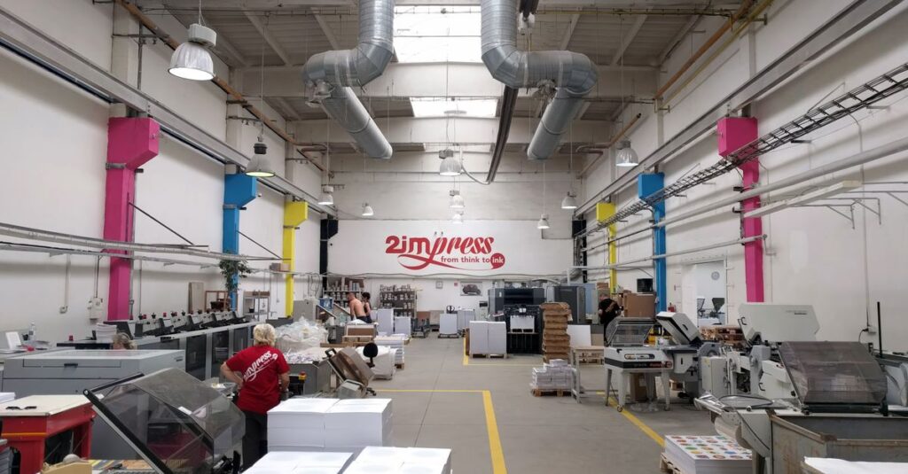

Here’s the thing you learn after forty years in this business: everyone wants the best colour printing. But half the time, they don’t know what they’re actually asking for.
A procurement manager sends a PDF with a complex logo. A school wants its crest to look “bright and proud” on ten thousand notebooks. And they all use the same phrase — “make it look good.”
But what makes colour printing look good? It’s not one thing. It’s the paper absorbing the ink without bleeding. It’s the cover staying crisp after a year in a backpack. It’s the school colours matching exactly, batch after batch, so the whole student body looks uniform. That’s the real search. It’s not just about colour; it’s about consistency, durability, and looking professional without a second thought.
If you’re ordering in bulk — whether for a corporate giveaway or an entire district’s school supplies — you can’t afford to get this wrong. The cost of a reprint is a headache nobody needs. Understanding what goes into it is the first step to not getting burned.
What “Best Colour Printing” Actually Means (It’s Not What You Think)
Most people think the “best” colour is the most vibrant. The brightest red. The deepest blue. And sure, that’s part of it. But in notebook manufacturing, the best colour is the one that lasts.
Think about a school diary. It gets shoved in bags, knocked off desks, pages get thumbed through daily. A logo printed with cheap ink? It starts to flake. The colours fade if it sits by a window. The paper itself can yellow, making the print look muddy. The “best” print job anticipates all that wear and tear. It uses ink formulations and binding techniques that lock the colour in.
It also means accuracy. If your brand Pantone is 2945 C, that’s what you should get on every single notebook, from the first one off the line to the last pallet shipped. No shifts toward purple or green. That kind of consistency is where real manufacturers separate themselves from jobbers. It’s technical, unsexy work. But it’s everything.
A Real-Life Snapshot
I was on a call last month with Anjali, a procurement head for a chain of coaching centres in Hyderabad. She was frustrated. Their previous supplier had sent notebooks where the orange in their logo looked more like peach on half the order. “The kids noticed,” she said. “They said the books looked cheap.” It wasn’t just a colour problem; it was a brand perception problem, delivered to teenagers — the toughest critics. We spent twenty minutes just talking about ink opacity and paper brightness. That’s the level this goes to.
The Three Pillars of Quality Notebook Printing
You can’t have one without the others. They’re a system.
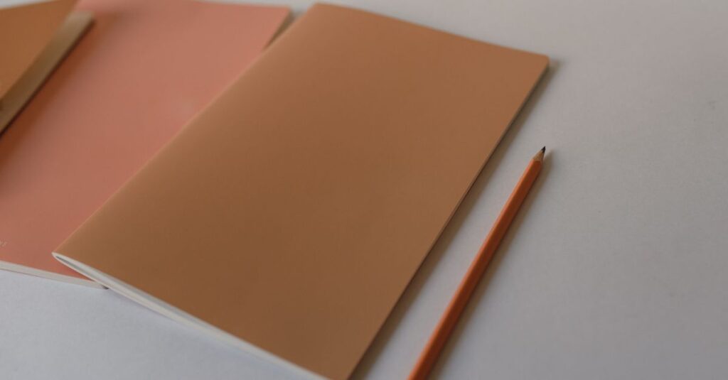
- The Paper (The Canvas): This is the biggest variable people overlook. You can put the finest ink on low-grade, porous paper, and it’ll soak in and spread like a stain. For crisp colour, you need paper with a certain smoothness and brightness. Our standard writing paper is around 54 GSM — it’s a sweet spot. Dense enough to hold ink on the surface, light enough to keep the notebook practical and affordable. For cover printing, we use thicker stock. The paper literally decides how much light reflects back, changing how the eye sees the colour.
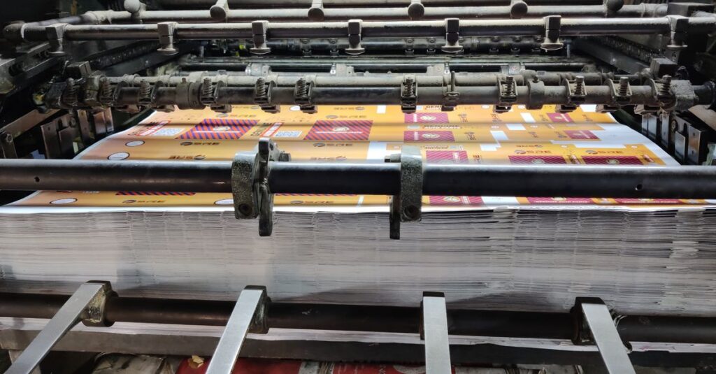
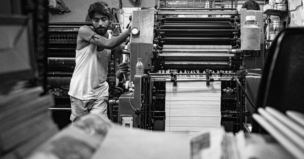
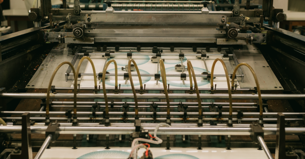
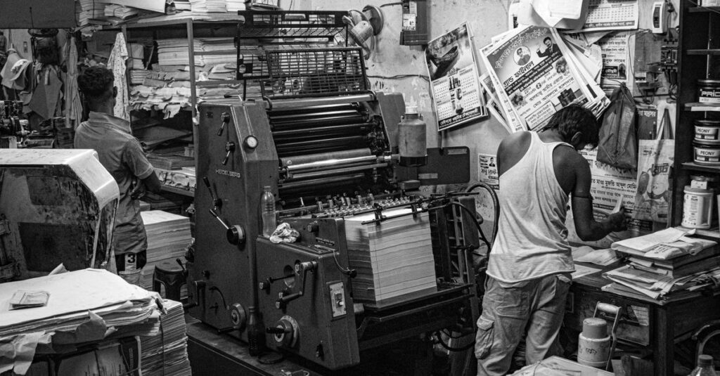
- The Ink & Printing Method (The Paint): We use offset printing for bulk runs. It’s superior for colour uniformity and vibrancy on large orders. The ink is oil-based, it dries solid. Digital printing has its place for super short, urgent runs, but for colour depth and cost-effectiveness on thousands of units? Offset is king. The ink needs to bond with the paper coating, not just sit on top.
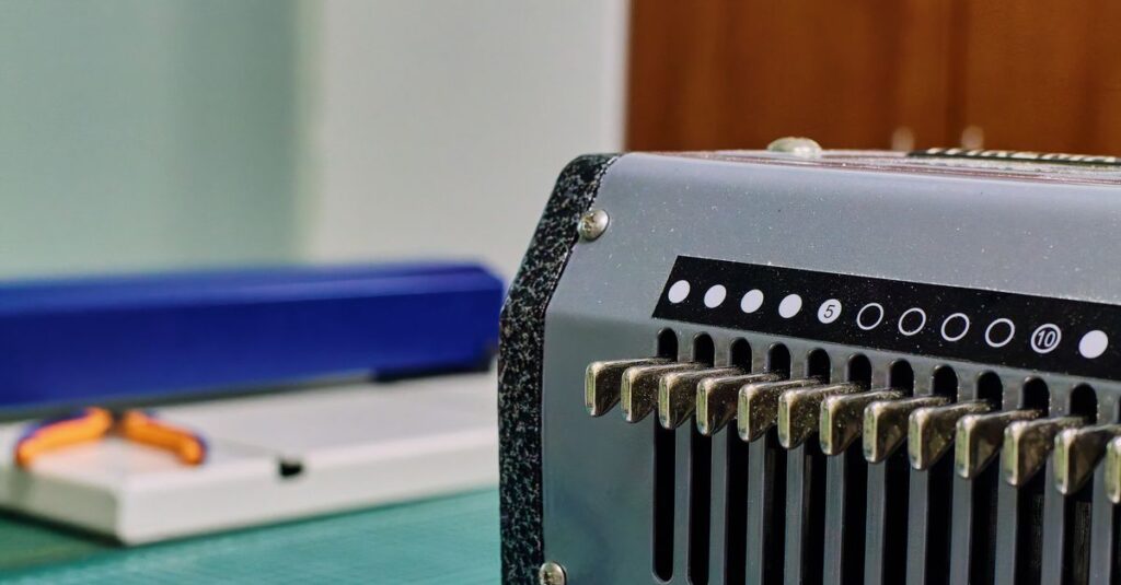
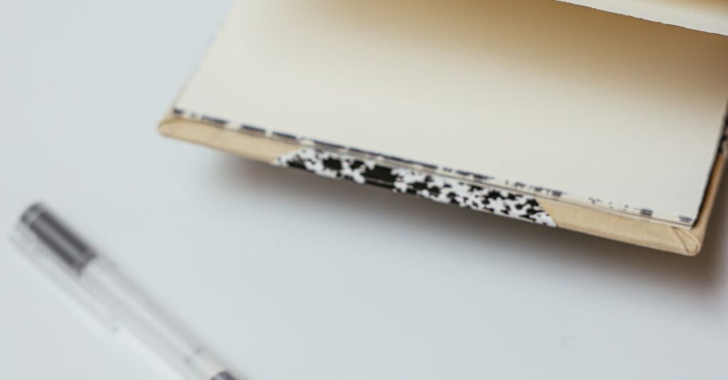
- The Binding & Finishing (The Protection): This is the secret. A beautifully printed cover is then laminated — a thin plastic film sealed over it. This isn’t just for shine. It’s a shield. It stops scuffs, moisture from hands, and UV light from fading the colours. A spiral-bound notebook gets handled constantly; the lamination is what keeps the cover art looking new until the last page is used.
Ignore any one of these, and your “best colour printing” project is on shaky ground.
Commercial vs. Artistic Printing: A Crucial Difference
I need to make a distinction here. It’s important.
Artistic printing is about expression. A photo book, a gallery print. The goal is emotion, impact on a single sheet. Commercial printing — what we do for notebooks — is about replication and function.
The goal is to reproduce the same approved design, perfectly, ten thousand times in a row, on a product that will be used hard. The colour must be durable, the registration (where different ink colours align) must be precise so text is sharp, and the whole process must be cost-effective enough to make sense for a bulk order. It’s engineering as much as it is art.
Sometimes a client will send a beautiful, gradient-heavy design that looks stunning on screen. And we have to talk them through simplifying it for print. Not because we can’t try, but because on certain papers, and at a certain speed of production, those subtle gradients can band or look patchy. The best result often comes from collaboration — adapting the art for the medium without losing its soul.
How to Spot a Quality Manufacturer (And Avoid the Talkers)
Anyone can promise great colour. You need to know what questions to ask. This is where you separate the real workshops from the front-office resellers.
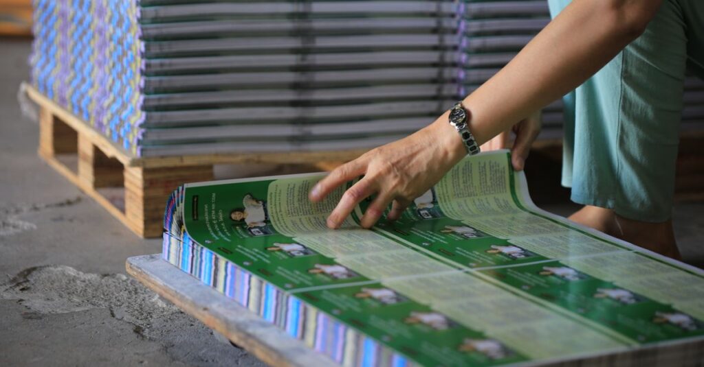
- Ask for physical samples from a past job. Don’t just look at the design. Feel the paper. Try to scratch the print lightly with a fingernail. Does it chip? Bend the cover. Does the colour crack along the spine? Look at the inside pages — is the ruling printing crisp and consistent, or are some lines fuzzy?
- Ask about their colour matching process. Do they work with Pantone codes? What’s their procedure if a batch looks off? A good factory has a colour calibration routine and a quality check station right on the floor.
- Ask about the timeline. If they promise an impossibly fast turnaround on a complex custom print job, be suspicious. Good colour work needs time for setup, proofing, and proper drying between stages. Rushing it is the fastest way to a disappointing result.
I’ll be direct: the cheap price is almost always the most expensive choice. You pay for it in frustration, delays, and a product that makes your organisation look second-rate.
| Consideration | Budget / Low-Quality Print | Professional / High-Quality Print |
|---|---|---|
| Ink Fading | Noticeable fading after a few months, especially if stored in light. | UV-resistant inks and lamination prevent fading for years. |
| Colour Consistency | Shifts can occur between batches; the blue on reorder might not match. | Strict colour matching ensures identical results across all batches. |
| Paper Show-Through | Dark colours on one side can ghost or shadow onto the opposite page. | Higher opacity paper and controlled ink application prevent show-through. |
| Durability | Prints scuff and chip easily with daily handling. | Laminated finishes and tough ink bonds withstand abrasion. |
| Fine Detail Reproduction | Small text or intricate logo lines become blurry or fill in. | High-precision plates and registration keep the finest details sharp. |
The Expert Insight That Changes the Conversation
Expert Insight
I was reading a trade journal last quarter, and an interview with a packaging scientist stuck with me. He said something like: “In commercial printing, you’re not selling colour. You’re selling trust. The consistency of the colour is a physical promise that everything else about the product is reliable.”
That hit home. A student sees their school crest printed perfectly, page after page. A client gets a corporate diary where your logo looks impeccable. That subconscious signal — “this was made with care” — is the real value of the best colour printing. It’s not decoration. It’s credibility.
Making the Right Choice for Your Order
So, what should you do next? Start with the end use.
- For Corporate Gifts & Premium Diaries: You’re signalling value. Go for thicker cover stock, full lamination (gloss or matte), and don’t shy away from bold, saturated colours. This is where branding matters most.
- For School Notebooks in Bulk: Durability is king. The print needs to survive a school year. Opt for sturdy binding (like stitched or double-spiral) and a laminated cover. Bright, cheerful colours are great for engagement, but the finish needs to be tough.
- For Internal Office Stationery: Function often leads. Clarity is key. The printing needs to be clean and professional, but you might choose a more cost-effective paper since the wear is less. Focus on crisp text and accurate logo reproduction.
The right manufacturing partner should guide you through this, not just take an order. They should ask about the use case. If they don’t, find someone who does.
Frequently Asked Questions
What’s more important for colour quality: the paper or the ink?
It’s a system, you can’t separate them. But if you force me to pick a starting point, it’s the paper. Garbage paper will make the best ink look bad. Good paper provides a proper foundation. The right ink then bonds to it correctly, giving you durability and vibrancy.
Can you match any colour I provide?
We can match any standard Pantone colour with very high accuracy. If you send a physical sample or a digital colour without a code, we’ll get as close as the physical printing process allows. For absolute critical matches, we always recommend approving a physical proof before the full run.
How does bulk ordering affect the colour printing quality?
Bulk ordering is where professional offset printing shines. The initial setup (plate-making, colour calibration) takes time, but once running, the colour consistency across thousands of units is far superior and more cost-effective than digital. The per-unit quality is higher and more stable in bulk.
What’s the difference between gloss and matte lamination?
Gloss lamination makes colours pop with a shiny, vibrant finish that feels slick. Matte lamination gives a sophisticated, non-reflective finish that feels smooth and soft. Both protect equally. The choice is aesthetic — gloss for high energy, matte for premium and professional.
Do you handle all the design work for custom notebooks?
We can, yes. Our team can take your concept and create a printable design, or we can work from your provided artwork files. Many of our private label clients prefer us to handle the entire process from design to delivery for simplicity.
Conclusion
The search for the best colour printing really boils down to finding a partner who sees the whole picture. It’s not a checkbox. It’s a series of linked decisions — paper, ink, finish, binding — all aimed at making your final product look professional and last.
I don’t think there’s one single “best” for everyone. A primary school’s needs differ from a law firm’s. But the principle is the same: the quality of the print is the first, most visible promise of the quality inside. It’s worth getting right.
If you’ve got a project in mind and want to cut through the sales talk to the technical details, let’s have a practical conversation. That’s usually where the best results start.