
You know the feeling.
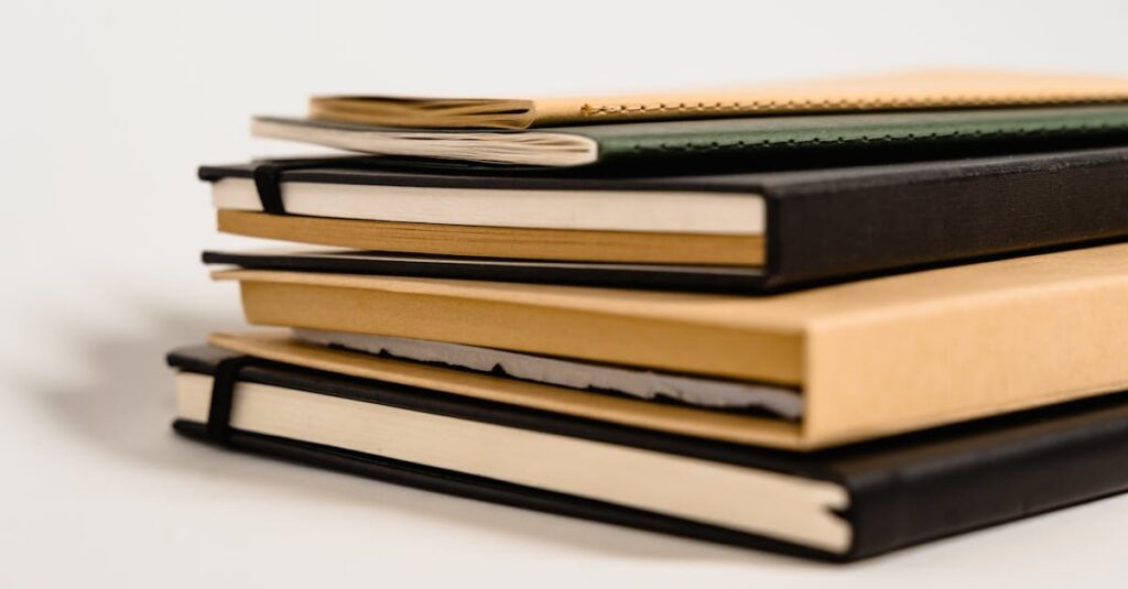
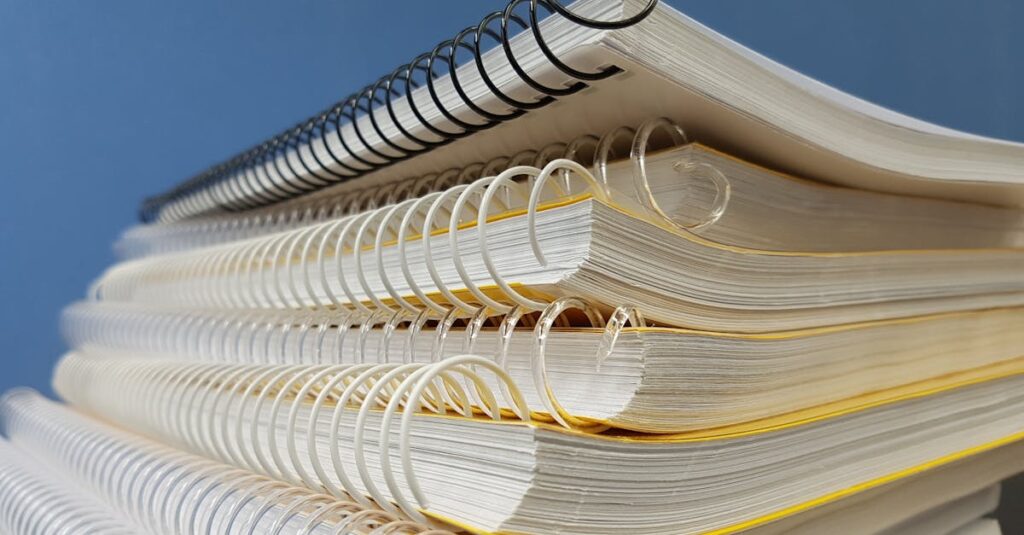
You open a box of notebooks you just ordered — a thousand of them, for your school or a corporate giveaway. You flip through one. The logo’s off-center. The margins are uneven on some pages. The ink looks faded. And that sinking feeling hits you right in the gut. You just bought a problem.
That’s what ‘perfect printing’ isn’t. It’s not a buzzword or a marketing tag. It’s the only thing that matters when you’re spending real money on bulk stationery. It’s the difference between a product that looks professional and one that screams ‘cheap mistake.’ And from what I’ve seen over years, most people think it’s just about the printer. It’s not.
If this sounds familiar — if you’ve ever been burned by inconsistent printing on a big order — this might be worth a look. It’s what we spend our days trying to fix.
Why ‘perfect printing’ isn’t about machines.
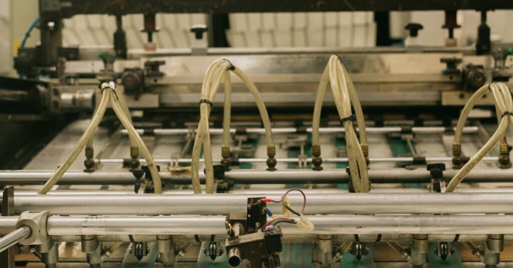
Nine times out of ten, when someone asks me about printing quality, they want to know what model of offset press we use. And sure, that matters. A Heidelberg or a Roland does things a basic machine can’t. But here’s the thing — a fancy printer in the wrong hands is just a very expensive way to make junk.
The real secret? It’s in the set-up. The pre-press. The guy who checks the plates, the lighting in the press room, the humidity that day. I was talking to one of our senior operators last week — over chai, actually — and he said something obvious that stuck. He said, ‘Perfect printing happens before you press start.’
Which is… a lot to sit with. Because it means the problem isn’t just technical. It’s about attention. The kind of attention most bulk suppliers can’t afford to give because they’re racing to hit a price point.
The anatomy of a flawed notebook: a real-life story.
Let me tell you about Anil. Anil runs procurement for a network of 15 private schools in Hyderabad. He’s 42, been doing this for a decade. Last year, he ordered 50,000 branded notebooks from a ‘reliable’ supplier. The samples were fine. The delivery was a mess.
Half the notebooks had the school crest printed a millimeter too high. On some, the red in the logo looked more like orange. The ruling lines weren’t perfectly parallel to the page edges. Kids noticed. Teachers complained. Anil spent three months dealing with emails, partial refunds, and the quiet humiliation of having to explain the mistake to his principal.
He didn’t order ‘bad printing.’ He ordered notebooks. But what he got was a masterclass in how cutting corners on process shows up in the final product. The real cost wasn’t the refund — it was the trust.
Expert Insight
I was reading an old industry journal once and one line stuck with me. This printer from Germany — been in the game for 50 years — said the most important tool in his shop wasn’t the press. It was the magnifying glass he used to check dot gain on the proofs. Dot gain. It’s this tiny, microscopic spread of ink on paper that makes text look blurry. Nobody buying notebooks thinks about dot gain. But every single notebook they’ve ever loved or hated was decided by it. I don’t have a cleaner way to put it than that. The quality you can feel starts with details you can’t even see.
Perfect printing vs. ‘good enough’ printing: what you’re actually paying for.
Let’s break it down. When you’re sourcing notebooks in bulk — for schools, for corporates, for government tenders — you’re usually presented with a price. That price includes paper, binding, and printing. The printing line item is often the most compressed. The supplier saves money by loosening tolerances.
What does that mean for you? A comparison helps.
| Factor | ‘Good Enough’ Printing | Perfect Printing |
|---|---|---|
| Color Consistency | Colors may shift between batches. Your corporate blue might look different on re-orders. | Color matching is calibrated. The Pantone blue you approved is the same blue in every notebook, every time. |
| Registration | Elements (logos, borders) can be slightly misaligned. The human eye picks this up as ‘sloppy.’ | Sharp, precise alignment. Every element hits its mark exactly where the design intended. |
| Ink Density | Uneven. Can look faded in spots, too dark in others. Especially noticeable on solid blocks of color. | Consistent, solid opacity from the first page to the last. No patchiness, no streaks. |
| Bleed & Margins | Inconsistent trim. Graphics might get cut off, or you get uneven white borders. | Controlled, uniform bleed. The page looks balanced and intentional after cutting and binding. |
| Long-run Stability | Quality can drift during a long print run. The first 1000 notebooks look better than the last 1000. | Continuous monitoring and adjustment. The 10,000th notebook is identical to the 1st. |
Look, I’ll be direct. ‘Good enough’ printing is what happens when the factory floor is managed by a spreadsheet. Perfect printing is what happens when it’s managed by a printer. That’s the shift.
How to spot a manufacturer who gets it (before you place the order).
So you’re evaluating suppliers. You’ve got quotes from three, maybe four notebook manufacturers. They all claim quality. How do you know who’s for real? Don’t just ask for samples. Ask for the wrong samples.
Here’s what I mean. Ask to see a physical print proof from a previous job — the actual sheet the client signed off on. Then ask to see a notebook from the middle of that production run. Compare them. Under a bright light. Check for the things in the table above.
Ask about their makeready process. (Makeready is the set-up time before a print run starts). If they brag about how fast it is, be wary. A rushed makeready is the first corner cut. A good printer takes the time to get it right.
And honestly? Ask to see the waste. Every print run has start-up waste — sheets that are used to get the color and alignment perfect before the good copies start. A transparent supplier will show you this. A messy one will hide it. The waste tells you everything about their standards.
It’s not just about looks. It’s about function.
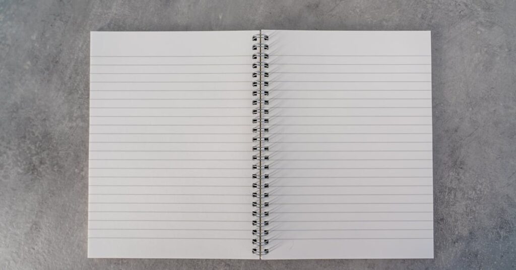
We’ve talked about logos and colors. But perfect printing matters just as much for the stuff you write on. The ruling lines. The page numbers. The headers and footers.
Think about a student’s math notebook. If the graph paper lines aren’t perfectly square, their diagrams are off. If the margin line wobbles, their notes look messy. This is where printing stops being cosmetic and starts being part of the product’s utility.
For corporate diaries, it’s the alignment of the date blocks, the crispness of the calendric grid. A smudged or misprinted date box makes the whole diary feel unreliable. And when you’re giving these to clients or employees, that feeling transfers. Subtly. Inevitably.
You’re not just buying paper and ink. You’re buying precision. Or you’re not.
The binding print paradox nobody talks about.
Right. This is the part nobody says out loud. The hardest place to get perfect printing? On the spine of a bound notebook.
It’s a curved, often glued surface. If the printer isn’t set up for it — if the foil stamping or screen printing isn’t calibrated for the curve and the glue — the title on the spine will crack, fade, or look warped. And that’s the first thing people see on a shelf.
I’ve seen orders where the front cover is flawless and the spine looks like an afterthought. It makes the entire production run feel cheap. Solving this means slowing down. It means using specific techniques for spine printing that a high-volume, low-margin shop will skip. Every time.
You have to ask about it. Specifically. Or you’ll find out the hard way.
Conclusion: The quiet confidence of getting it right.
At the end of the day — and I mean that literally, after the presses stop — perfect printing comes down to a choice. The manufacturer’s choice to care about the details your buyer will feel before they can name them. And your choice to find a partner who makes that same choice.
It’s not the cheapest path. It never is. But it’s the one that doesn’t end with that sinking feeling when you open the box. It ends with quiet confidence. You know the job is done. And done right.
I don’t think there’s one magic trick here. Probably there isn’t. It’s just a hundred small things done carefully. But if you’ve read this far, you already know what you’re looking for in a supplier — you’re just figuring out if it’s okay to demand it. It is. Start the conversation with someone who understands the difference.
Frequently Asked Questions
What exactly does ‘perfect printing’ mean for notebooks?
It means consistent, sharp, and precise results across an entire print run. Every logo is centered, every color matches the approved sample, every line is crisp, and there’s no variation from the first notebook to the last. It’s the technical and operational standard that prevents flaws.
How can I check printing quality before placing a large bulk order?
Don’t just approve a digital proof. Insist on a physical, printed proof on the actual paper stock you’ll be using. Then, ask for a ‘production sample’ — a notebook pulled from the middle of a previous run for another client. Compare them side-by-side under good light for color, alignment, and sharpness.
Does perfect printing cost a lot more?
It costs more than the absolute cheapest quote, yes. Because it requires better materials, more skilled labor, and slower, more careful press checks. But it often costs less than the reprints, refunds, and reputational damage you face when a ‘budget’ print job goes wrong on 10,000 units.
Is digital printing or offset printing better for perfect results on bulk notebooks?
For bulk runs (thousands of units), modern offset printing is still the king for perfect, consistent color and sharpness at scale. Digital printing has come a long way, but for large quantities of identical notebooks, offset provides superior color consistency and durability, which is the core of perfect printing.
Can you get perfect printing on any type of notebook paper?
Not exactly. The paper is part of the equation. Low-quality, overly porous, or uneven paper will sabotage the best printer. Perfect printing requires a partnership with good, consistent paper stock (like our standard 54 GSM writing paper) that accepts ink uniformly and provides a stable surface.