Why Your Business Cards Are Probably Embarrassing You
You’re ordering 500, or maybe 5,000. You’ve got the logo file. You found the cheapest quote online. The cards arrive. They look okay… from a distance. But when you hand one to a potential client at a conference, it feels thin. It bends in their hand. The ink smears if they rub it. The silence while they look at it is heavier than it should be.
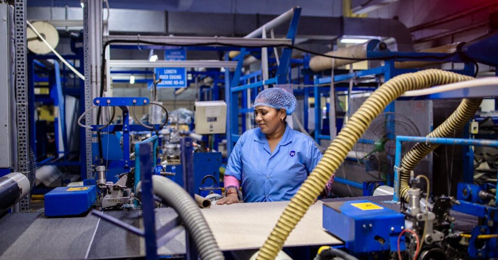
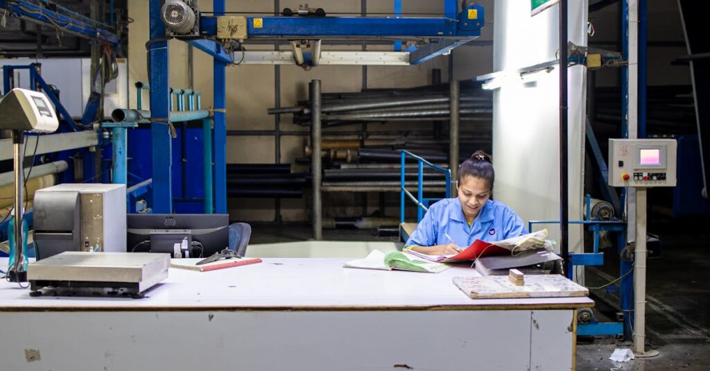
And here’s the thing — it’s not about vanity. It’s about trust. Your business card is a tiny, tangible piece of your company’s credibility. It’s the first physical thing a new contact holds from you. If it feels disposable, what does that say about how you view your own business, or your relationship with them? I’ve been on the manufacturing side of this for decades, watching procurement managers try to shave 10% off a printing order, only to hear later that the cards were “a bit underwhelming.” The real cost isn’t on the invoice. It’s in the missed opportunity. If you’re sourcing corporate diaries or bulk notebooks, you already know quality matters. So why treat your cards differently? The principles are exactly the same.
The Paper Isn’t Just Paper. It’s a Signal.
Most people think paper weight is about thickness. It’s not. It’s about density and feel. That flimsy 300 GSM card stock that folds like a napkin? It tells a story of rushed decisions and bottom-line priorities. The heavier, crisp 400 GSM card with a slight texture? That says stability, substance, attention to detail.
I was talking to a procurement manager from a mid-sized tech firm last month. She’d ordered 2000 branded notebooks for a client event and 5000 business cards for the sales team. The notebooks were great — good paper, solid binding. The cards were… budget. She told me, “The sales guys started leaving them in the hotel lobby instead of handing them out. They said they felt cheap.” That’s the real feedback. It doesn’t come in a report. It comes in abandoned boxes of unused cards.
Think about it this way. You’re buying notebooks for a school. You wouldn’t pick the ones with paper so thin the ink bleeds through, right? Because it affects the user’s experience every day. A business card is a one-time interaction, but it’s a concentrated dose of your brand’s quality. The choice of paper — its GSM, its finish, its coating — is the single biggest signal you send before anyone reads a word.
Expert Insight
I was reading an old industry report a while back — something about tactile marketing — and one line stuck with me. The researcher said something like: “In a digital-first world, the physical artifacts we choose become disproportionately powerful. They’re rare. They’re deliberate. A bad one isn’t just bad. It’s a conspicuous failure.” I don’t have a cleaner way to put it than that. When everything is pixels on a screen, the weight of a card in someone’s hand, the sound it makes when placed on a table, becomes part of your message. And most companies are sending the wrong one.
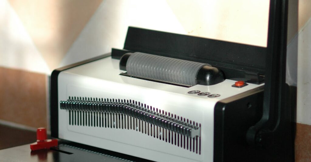
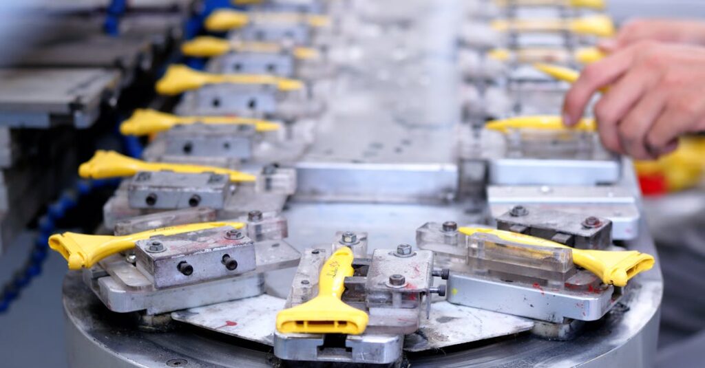
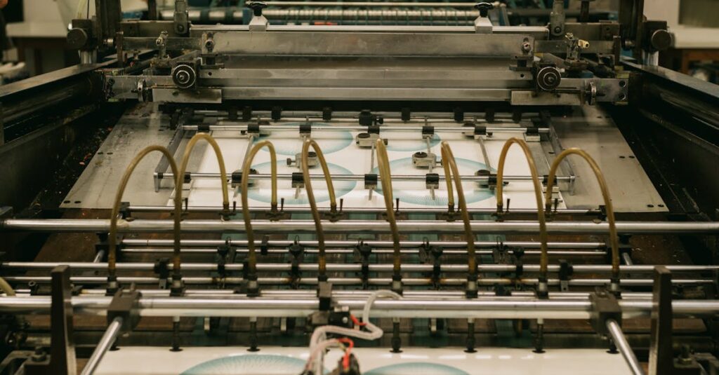
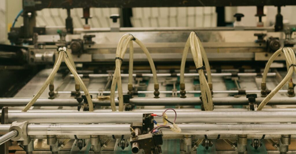
Printing: Where Digital Wins and Offset Fails (Sometimes)
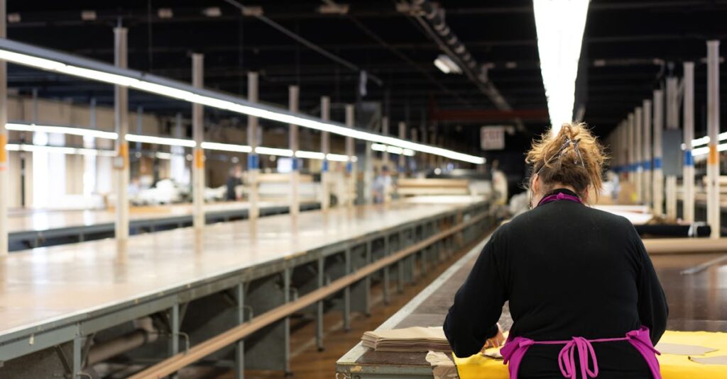
Okay, let’s get technical, but only as much as you need to. There are two main worlds in commercial printing: digital and offset. Digital printing is fantastic for short runs, quick changes, and complex designs with lots of photos. It’s what you use for 500 cards with a unique QR code for each sales rep. Offset printing is the heavyweight champ for bulk. It’s for your 10,000-card order where consistency across every single card is non-negotiable. The colors are richer, the ink sits better on the paper, and the cost per unit drops dramatically at scale.
The mistake I see all the time? Companies using digital for bulk orders because the setup seems easier. The result is a slight variation in color from box to box, and ink that doesn’t have the same depth. Or worse, using offset for a tiny, experimental run and paying a fortune for it. You need to match the method to the mission. If you’re a stationery distributor ordering 50,000 notebooks, you’re already in the offset world. Your card order should live in the same universe.
And then there’s the finish. Matte, glossy, soft-touch, spot UV. Glossy looks shiny and professional but can feel slippery and generic. Matte feels sophisticated but can show fingerprints. Soft-touch is this velvet-like coating that makes people literally stop and feel the card. It’s expensive. It’s also memorable. The question isn’t which is best. It’s what does your brand feel like? This is the same conversation we have with schools about notebook covers.
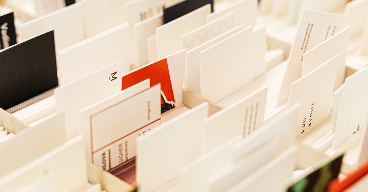
A Real Story About a Real Card
Rahul, 42, procurement lead for a chain of co-working spaces in Hyderabad. He ordered 5,000 custom notebooks for members and 2,000 business cards for the community managers last quarter. The notebooks were perfect — durable, clean print. The cards were done locally on a rush job. 350 GSM, digital print, glossy finish. He handed one to a potential corporate client looking to book 50 desks. The client took it, glanced, and slid it into his pocket without a second look. A month later, Rahul met him again. The client pulled out a competitor’s card from his wallet — thick, matte, with a textured edge. “I kept this one,” he said. “It felt like a real company.” Rahul didn’t need a survey to understand the loss.
Business Cards vs. Corporate Diaries: The Comparison You Didn’t Think About
You probably evaluate notebooks and diaries on a different checklist than cards. But they’re all printed, physical brand artifacts. The quality decisions are parallel. Look at this:
| Feature | Business Card (High-Quality) | Corporate Diary (High-Quality) |
|---|---|---|
| Paper Weight (GSM) | 400+ GSM card stock | 70-80 GSM interior, 250+ GSM cover |
| Printing Method | Offset for bulk, Digital for short runs | Offset printing for consistency |
| Binding / Durability | Coating for scratch resistance | Stitched or spiral binding for daily use |
| Customization Level | Full color logo, spot finishes | Cover imprint, header/footer branding |
| Cost Driver | Paper quality, finish, print technique | Paper volume, binding type, page count |
| Perception Signal | Immediate credibility & attention to detail | Long-term utility & organizational support |
The point is this: if you’re approving a budget for 1000 corporate diaries where quality is a given, you’re already valuing print durability and paper feel. Applying a “cost-saving” mindset just to the business card order creates a mismatch in your brand’s physical presence. It’s like buying a good suit and wearing cheap shoes.
The Practical Stuff: What to Actually Ask Your Printer
So you’re ready to not cheap out. Great. Here’s what you need to say, beyond just sending a PDF.
- “What GSM card stock options do you have for 400+?” Don’t accept “standard.” Ask for samples. Feel them.
- “For 5,000 units, is this an offset or digital job?” If they say digital for that quantity, question it. Dig.
- “Can I see samples of your matte, glossy, and soft-touch finishes?” Touch them. Rub them. See how they wear.
- “What’s the turnaround if we need a small redesign mid-run?” Flexibility matters. Cheap printers lock you in.
- “Do you handle matching colors to our existing brand materials?” Your cards should look like they belong with your notebooks.
And one more thing — ask about the waste. Good printers plan runs efficiently. Bad ones overprint and trim poorly, leaving you with cards that have misaligned edges. It’s a small thing. It’s also a visible thing.
Look, I’ll be direct. Most corporate buyers treat business cards as a commodity item. They’re not. They’re a strategic print product. The same expertise that ensures a school notebook doesn’t fall apart after a month of use is what ensures a business card doesn’t feel like a throwaway. It’s all manufacturing. It’s all print quality. It’s all binding and coating and paper science. The mindset should be the same.
FAQ: Business Cards and Printing
What’s the most common mistake businesses make with business card printing?
Choosing paper weight (GSM) based on price alone. They go for 300 GSM because it’s cheaper than 400, but the difference in feel and durability is huge. A thin card bends, feels insubstantial, and often wears poorly. It’s the first thing people notice, even before they look at the design.
Is digital printing okay for large orders of business cards?
Usually, no. For orders above 2,000-3,000 cards, offset printing is better. It gives more consistent color across the entire run, better ink adhesion, and a lower cost per card at scale. Digital is for short runs, prototypes, or cards with variable data (like unique codes).
How does business card quality relate to other corporate stationery, like diaries?
They’re part of the same brand ecosystem. If you invest in high-quality paper and binding for your corporate diaries, using flimsy cards creates a disconnect. It tells people you care about long-term tools for them, but not about the first impression you give. The quality standards should be aligned.
What’s a “finish” and which one should I choose?
The finish is the coating on the printed card. Glossy is shiny and protective but can feel generic. Matte is smooth and professional but shows smudges. Soft-touch is a velvety, premium coating that people literally feel. Choose based on your brand’s personality — glossy for bright/tech, matte for elegant/professional, soft-touch for luxury/creative.
Can I get my business cards printed by my notebook manufacturer?
Often, yes. Many integrated manufacturers like us offer commercial printing services alongside notebook production. The advantage is consistency — the same attention to paper quality, print sharpness, and color matching applies. It simplifies sourcing and ensures a cohesive look across all your branded stationery.
The Part Nobody Says Out Loud
You’re not just buying cards. You’re buying confidence. For your sales team, for your reception desk, for yourself. When a card feels right in your hand, you hand it over with a different kind of ease. There’s no subconscious hesitation. You know it represents your work well.
I think about this a lot — how the smallest physical object in your corporate toolkit can carry the heaviest perceptual weight. In a stack of 100 cards, the difference between cheap and quality is maybe a few thousand rupees. In the hand of one important person, the difference is infinite.
I don’t have a clean answer for where you should draw the line on cost. But if you’ve read this far, you already know the feeling you want that card to evoke. The question is whether you’re willing to pay for the paper that delivers it. Sometimes, talking to someone who makes things for a living helps.