Look, I’ve Seen a Lot of Diaries
Alright. Let me start here. You’re a procurement manager, or maybe a business owner ordering corporate gifts for the year. You’ve got a list, a budget, and a thousand other things to do. You need diaries. You go online, search ‘diary cover design,’ and get a wall of shiny images and vague promises.
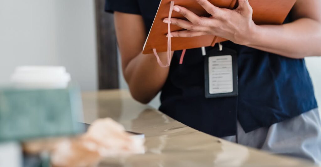
Here’s what you’re actually thinking, right? “Will this look cheap? Will my boss approve it? Will our clients even use it, or will it go straight into a drawer?” I get it. Because for over 40 years at Sri Rama Notebooks, I’ve watched people make this exact decision. They flip through samples, feel the covers, squint at the print quality. And nine times out of ten, the cover decides the whole thing.
The problem isn’t just getting a diary made. It’s getting one that feels right — that communicates something about your company before a single page is turned. That’s the headache, honestly. And most of the advice out there is from designers talking about aesthetics, not from manufacturers who know what actually works on a production line for 5,000 units. If you’ve ever worried your corporate gift might send the wrong message, this might be worth a look.
What Even Is “Good” Diary Cover Design?
It’s not just a pretty picture. Let’s get that out of the way first. When I say “diary cover design,” I’m talking about the entire physical artifact — the material, the texture, the weight in your hand, the way the logo sits, the spine’s durability. It’s a functional piece of branding.
Think about it this way. A client gets your diary. Before they read “Happy New Year 2024 from Acme Corp,” their brain has already registered three things: weight, texture, and sound. A flimsy, plasticky cover that bends? That says “we went with the cheapest option.” A heavy, linen-textured cover with a clean, debossed logo? That says “we pay attention to details.”
The design has to survive. Not just emotionally, but physically. It sits on a desk for a year. It gets thrown in bags, coffee gets spilled near it, pages get dog-eared. A good cover design accounts for that life. It uses materials that age well, not ones that peel or fade by March.
A Real-Life Thing I Saw
I was talking to a procurement head from a tech company in Hyderabad last month — over a very rushed phone call, actually. She had ordered 2,000 diaries the previous year from another supplier. The design looked great on the PDF. But the actual print was slightly blurry, the gold foil flaked off, and the binding started to give way by June. Her feedback? “We looked amateurish. I had to apologize to our sales team.” She wasn’t angry about the money. She was embarrassed. That’s the real cost of a bad cover design: it’s not the invoice, it’s the reputation hit.
Anyway. Where was I.
The Three Things Your Cover Needs to Do (That Nobody Talks About)
Most guides will tell you about color theory and logo placement. Fine. But from a manufacturing and user perspective, here’s what actually matters.
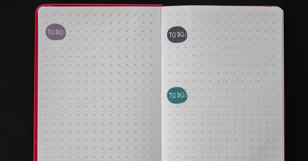
First, it needs to invite use. A diary with a stiff, awkward cover or a weird clasp that’s hard to open will stay shut. Your branding will sit in a cupboard. The cover should feel good to open and close, repeatedly. That means considering the binding type from the start — a perfect-bound diary lays flat differently than a spiral-bound one, and your cover design has to work with that.
Second, it needs to be legible from a distance. On a busy desk, what stands out? Is it a tiny, intricate logo that becomes a smudge at three feet? Or is it a clear, bold, simple mark? This is where companies overthink. They want to put their entire ethos on the cover. You can’t. You have one second of visual attention. Use it.
And third — this is the big one — it needs to feel cohesive with the inside. Nothing worse than a gorgeous, minimalist leather-look cover that opens to cheap, greyish paper with faint rulings. The experience falls apart. The cover sets a promise; the paper and printing inside have to keep it.
You’re not just designing a surface. You’re designing an expectation.
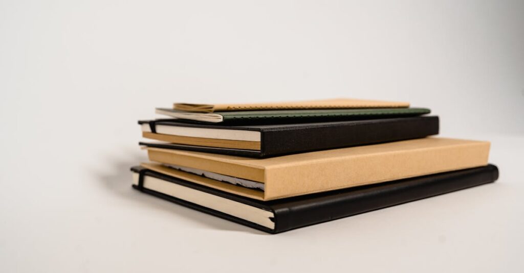
A Quick, Honest Comparison: Standard vs. Custom Cover Design
Let’s be practical. You’re often choosing between a standard template from a catalog and a fully custom job. Here’s the real difference, stripped of the sales talk.
| Aspect | Standard / Template Design | Full Custom Design |
|---|---|---|
| Cost | Lower upfront. You’re sharing the tooling cost with others. | Higher initial cost for plates, dies, and setup. Becomes cheaper per unit at very high volumes. |
| Uniqueness | Limited. Your logo is placed into a pre-existing layout. Other companies might have a similar look. | Complete. Every element is yours. It can tell your specific brand story. |
| Lead Time | Shorter. The manufacturer can often pull from existing stock or run a quick print job. | Longer. Requires design approval, proofing, and creating new manufacturing tools. |
| Flexibility | Low. You choose from offered materials, finishes, and spot colors. | High. You can specify special papers, unique embossing, mixed materials, custom foil colors. |
| Best For | Internal team diaries, smaller batches, tight budgets, or quick turnaround needs. | Client gifts, executive diaries, premium branding exercises, and large annual orders where impression is critical. |
The choice isn’t about which is “better.” It’s about what your budget and brand need actually are. A well-executed standard design beats a poorly planned custom design every single time.
How to Talk to a Manufacturer About Your Cover Design
This is where most projects go off the rails. You send a JPEG to a factory and expect magic. It doesn’t work like that. Here’s how to get what you actually want.
Start with the end use. Tell them: “These are for our mid-level managers, they’ll carry them to meetings,” or “These are high-end gifts for C-suite clients, they’ll sit on desks.” That tells us about durability, size, and perceived value needed.
Ask about their real capabilities. Not what’s on their website. Say, “What are the three most popular cover materials you run for corporate clients?” or “Can I see samples of your embossing vs. foil stamping?” A good manufacturer will guide you. If they just say “yes, we can do that” to everything, be wary.
Always, always get physical proofs. A proof isn’t just a PDF. It’s a mock-up of the actual cover material, with the actual print or finish on it. Colors on screen lie. Textures don’t exist on screen. I don’t care how busy you are — skipping this step is how you get a surprise you won’t like.
And understand the constraints. Want a full-bleed photo on a leatherette cover? The grain of the material might affect the clarity. Want a neon pink foil? The foil stock might be limited. Your manufacturer should explain these things, not just take the order. Actually, a good one will push back with better suggestions. That’s the kind of conversation you should be looking for.
Expert Insight
I was reading an old industry journal a while back — one of those trade things that mostly collects dust. But there was a quote from a brand manager that stuck with me. She said something like, “The diary is the only piece of our marketing that gets a daily, intimate touch for a whole year. It’s not an ad; it’s a companion.”
I don’t have a cleaner way to put it than that. It reframes the whole thing. You’re not buying a product. You’re commissioning a year-long brand experience. Every pen stroke, every meeting note, happens in the context of the cover you designed. That’s a lot of responsibility. And most people don’t think about it until they hold a bad one.
Common Mistakes (And How to Dodge Them)
Let’s run through the classic blunders. I’ve seen each one a dozen times.
- Overcrowding: Putting the logo, tagline, website, phone number, address, founding year, and a motivational quote all on the front. It looks desperate. Pick one or two elements. Maximum.
- Ignoring the Spine: If the diary is thick, the spine is prime real estate. It’s what people see on a shelf. Leaving it blank is a missed opportunity. At minimum, put the logo and year there.
- Forgetting the Back: The back cover is a quiet space. You can put extra info here, use a subtle pattern, or just leave it clean. But decide on purpose. A completely blank, low-quality card back feels unfinished.
- Designing in a Vacuum: Creating a beautiful design that’s impossible to print cost-effectively at your required volume. Talk to your printer early. Understand what’s easy (flat color) vs. hard (gradients on certain materials) vs. expensive (custom metallic inks).
The goal isn’t to make a piece of art for a gallery. It’s to make a functional, beautiful, durable thing that makes your company look smart for having made it.
Which is… harder than it sounds.
So, What Should You Do Next?
If you’re responsible for ordering these things, your job is part creative, part logistician, part quality control. It’s a headache, honestly.
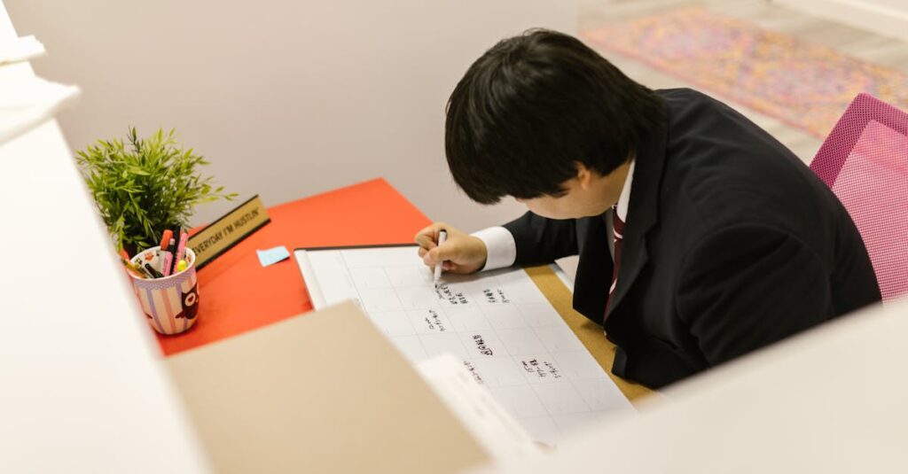
Start by gathering inspiration, but from the real world. Not Pinterest. Look at the diaries on your own desk, or in your colleagues’ offices. Which ones feel good? Which ones are falling apart? Which designs do you remember? That’s your best research.
Then, find a manufacturer you can actually talk to. Someone who asks questions about your use case, who sends you actual samples without you begging, who explains the trade-offs between a 250 GSM card cover and a PU leather wrap. The relationship matters because this isn’t a one-time buy. It’s an annual project.
I don’t think there’s one perfect cover design. Probably there isn’t. The “right” design is the one that aligns your brand’s image with a realistic budget and gets delivered on time, looking exactly like the proof you approved. That’s the whole game.
If you’ve read this far, you’re past the basic questions. You’re figuring out how to make a decision you won’t regret in six months. And that’s the only place worth starting from.
Frequently Asked Questions
What is the most durable material for a diary cover?
For heavy daily use, hardcover options like 250+ GSM art card with a laminated finish or PU (polyurethane) leather are tough. They resist bending, scuffs, and spills. Soft-touch laminated paper covers are popular and feel premium but are better for lighter use. Always ask your manufacturer for a sample to test.
How long does custom diary cover design and production take?
It depends heavily on complexity. A simple logo print on a standard cover can take 2-3 weeks after final approval. A full custom design with special finishes (embossing, foil) can take 6-8 weeks, as it involves creating new dies and multiple proofing stages. Always build in buffer time for approvals and shipping.
Can you print full-color photos on any diary cover?
Technically, yes, with digital printing. But the result depends on the base material. Photos look best on smooth, coated papers or specific synthetic materials. On textured surfaces like linen or certain leathers, fine details can get lost. It’s crucial to get a physical proof on the exact material you plan to use.
What’s the difference between embossing and foil stamping?
Embossing creates a raised (or sometimes depressed) design by pressing the cover material with a metal die. It’s tactile but usually one color (the color of the material). Foil stamping uses heat and pressure to transfer a thin, pigmented metallic or colored foil onto the surface. It’s shiny and colorful. They’re often combined for a luxe effect.
We need a small batch of custom diaries. Is that possible?
Yes, but the economics change. For very small quantities (under 500), digital printing is your friend as it has no plate costs. However, some premium finishes like custom foil stamping have high setup costs that make them impractical for tiny runs. Be upfront about your quantity with your manufacturer to find the best solution.