Introduction
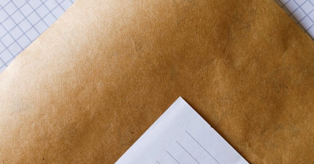
Okay, let’s be honest. You see a thousand quotes for “color print notebooks.” Some are dirt cheap. Others are triple the price. And the guy on the phone says something vague about “CMYK” and “resolution.” You hang up, no closer to understanding what you’re actually paying for. Right?
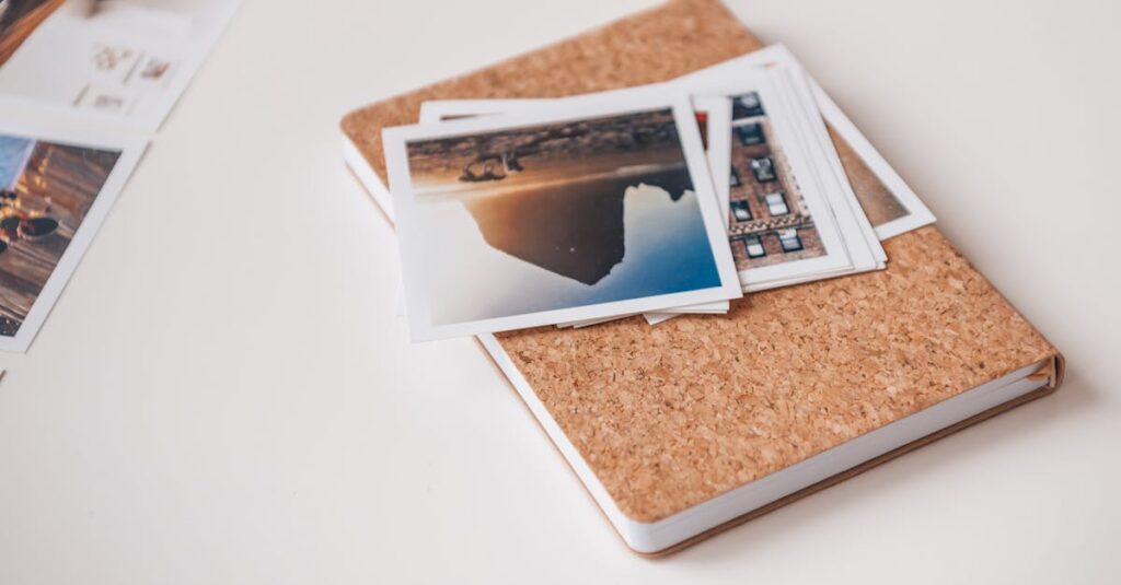
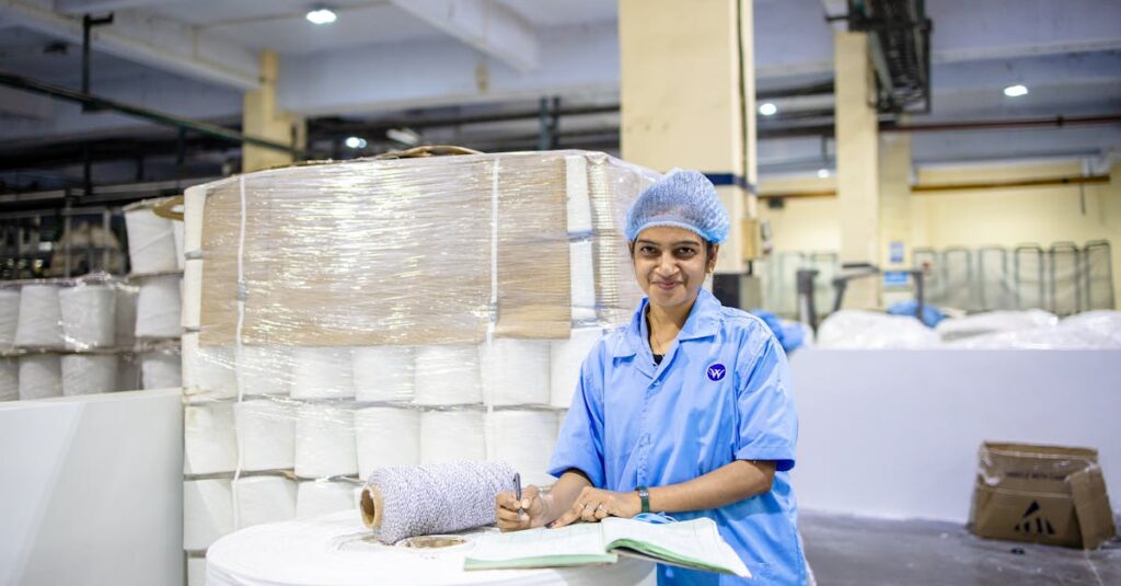
Here’s the thing. When you’re ordering 5,000 notebooks for a school district or 10,000 diaries for a corporate giveaway, you’re not just buying stationery. You’re buying a piece of your brand that people will touch, write in, and keep on their desk. And the print on the cover is the first thing they see. It sets the tone. A muddy, pixelated logo makes you look, well, not great. But a sharp, vibrant cover? That’s a different story.
This isn’t about print tech jargon. It’s about getting what you pay for. It’s about knowing the right questions to ask so you don’t end up with 20,000 notebooks that look like they were run through a cheap copier. If you’ve ever felt lost in the weeds of DPI, PMS, and litho printing, this might be worth a look.
What “Color Print” Actually Means in Notebook Manufacturing
Right. Let’s break this down. In our world — notebook making — “color print” isn’t one thing. It’s a spectrum. On one end, you have basic single-color stamping. On the other, you have full-color photographic reproduction. Most of what schools, corporates, and distributors need sits somewhere in the gloriously messy middle.
I think about it this way. Color printing for notebooks is about transferring ink from a plate (or a digital file) onto paper or cardstock, in a way that’s durable, cost-effective for bulk, and looks the way you imagined it. The biggest headache for buyers is when their vision doesn’t match the manufacturer’s capability. You send a beautiful, full-color logo file, and you get back a two-tone approximation because that’s all their machine can do. Frustrating? Absolutely.
And that’s the real starting point. Knowing what you want is one thing. Knowing what’s possible — and what makes sense for your order quantity — is everything else. Most people I’ve spoken to don’t realize that the choice of printing method is the single biggest factor in cost and quality. It’s not the paper, surprisingly. It’s the ink on it.
The Two Main Roads: Offset vs. Digital
These are the two giants. And picking the wrong one is probably the most common — and expensive — mistake.
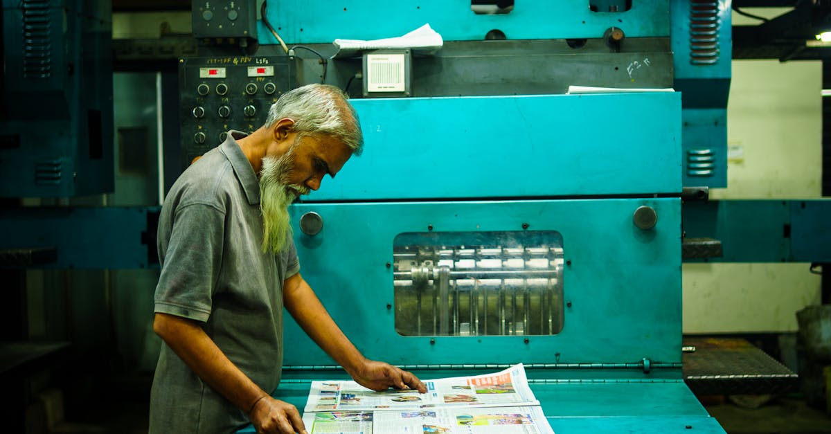
Offset Printing (Lithography): This is the old-school workhorse for bulk. Think huge metal plates, rollers, and industrial-scale presses. It works by transferring ink from the plate to a rubber blanket, then onto the paper. Sounds complicated, but the result is incredibly sharp, consistent color across tens of thousands of copies. The catch? It has a high setup cost. Making those plates takes time and money. So, for a run of 500 notebooks? Terrible idea. For 50,000? The price per unit plummets, and the quality is unbeatable. It’s the only way to go for true brand colors (more on that in a second).
Digital Printing: This is your modern, desktop-printer-on-steroids method. It prints directly from a digital file onto the paper. No plates. The setup is almost zero. Want to change the design on every tenth notebook? No problem. This is fantastic for short runs, test batches, or highly customized orders where every cover is different. But. And it’s a big but. The color consistency can waver across a large batch. The ink sits on top of the paper differently, and it can sometimes look… flatter. Less rich.
The question isn’t which is “better.” It’s which is right for your specific pile of money and your specific pile of notebooks.
The Real-Life Cost of Getting It Wrong
I was talking to a procurement manager for a chain of coaching institutes last month — over a truly terrible cup of airport coffee, actually — and he told me a story that stuck. They’d ordered 15,000 branded notebooks for new students. Went with the cheapest quote, which promised “vibrant color print.” What arrived had logos that were slightly blurry. Not enough to reject the shipment outright, but enough that every student who picked one up got a subliminal message: “This place is a bit cheap.” He said the brand manager had a fit. They ended up using them as internal scratch pads and re-ordering the whole lot. The “savings” cost them triple in the end.
That’s the silent tax of bad color printing. It’s not just a defective product. It’s a ding to your professionalism. For a corporate client giving diaries to partners, a fuzzy logo whispers unreliability. For a school, dull, washed-out textbook covers just feel sad. You know it when you see it. The colors feel tired before the first page is even written on.
This is the part nobody says out loud when they’re giving you a quote: the cheapest option often gets you the cheapest feel. And in bulk orders, feel is everything.
Breaking Down the Jargon: CMYK, Spot Colors, and DPI
Look, I’ll just say it. Sales reps love this stuff because it makes them sound smart. Let’s translate it into something you can actually use.
CMYK (Full-Color Process): This is how you print photographs or complex graphics with gradients. C (Cyan), M (Magenta), Y (Yellow), and K (Key/Black) are layered in tiny dots to create the illusion of millions of colors. Think of a magazine photo. This is what most digital printers and offset presses use for full-color jobs. It’s versatile but can struggle with very specific, bright brand colors. Your company’s exact shade of blue might come out a little different every time.
Spot Colors (PMS Colors): This is the secret weapon for branding. Instead of mixing four inks, you use one pre-mixed, specific ink. Pantone Matching System (PMS) is the universal library. You say “PMS 300 C,” and any printer in the world can mix that exact shade of blue. It’s consistent, vibrant, and often more opaque. This is why corporate logos on premium diaries look so crisp and identical everywhere. It costs more per color, but for one or two brand colors, it’s non-negotiable for serious branding.
DPI (Dots Per Inch): This is about the sharpness of your supplied artwork. 300 DPI is the absolute minimum for print. That blurry logo you pulled from your website footer (probably 72 DPI)? It will print blurry. Every time. Sending high-resolution vector files (like .AI or .EPS) is the best way to avoid this headache altogether. They’re infinitely scalable. No pixelation, ever.
Anyway. Where was I. Right — knowing this stuff lets you push back. When a supplier says “we can match that blue,” you can ask, “Will you be using a PMS spot color or simulating it with CMYK?” The silence that follows is usually very informative.
Comparison Table: Offset vs. Digital Color Printing for Notebooks
| Factor | Offset Printing | Digital Printing |
|---|---|---|
| Best For | Large bulk orders (10,000+ units) | Short runs, prototypes, variable data |
| Setup Cost & Time | High (plate creation) | Very Low (digital file ready) |
| Cost Per Unit (Large Run) | Very low | Higher |
| Color Consistency | Excellent across entire batch | Can vary slightly |
| Brand Color Accuracy | Superb with Spot (PMS) colors | Good, but simulated via CMYK |
| Turnaround Time (Post-Setup) | Very fast for printing | Fast |
| Design Flexibility | Fixed per plate | High, can change on the fly |
And honestly? This table makes the choice pretty clear most of the time. Are you ordering for an annual corporate giveaway where branding is king? Offset with spot colors. Need 500 custom notebooks for a workshop next week? Digital is your friend.
How to Brief a Manufacturer (Without Sounding Clueless)
This is the practical part. You don’t need to be a printer. You just need to ask the right questions. Here’s what actually matters when you’re talking to a factory like ours.
- Quantity First: Always lead with this. “We need 25,000 A4 notebooks.” This immediately tells me whether to think about firing up the offset press or the digital machine.
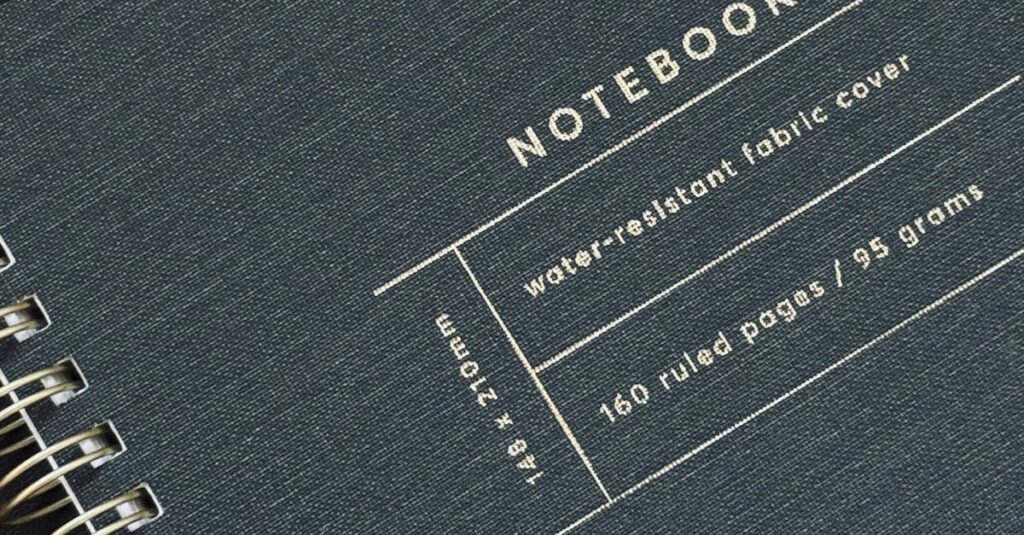
- Provide the RIGHT File: Say it with me: Vector Art. Send your logo as an .EPS or .AI file. If you only have a JPG, ask your designer for the source file. This one step prevents 90% of quality complaints. If you’re using complex photos, send high-res (300 DPI) TIFFs or PSDs.
- Specify the Colors: “Use PMS 185 C for the red and black for the text.” Or, “This is a full-color CMYK image.” Be specific. If you have a Pantone swatch, mention the number.
- Ask for a Physical Proof: Never, ever approve color from a screen. Screens emit light; ink absorbs it. They are fundamentally different. A good manufacturer will send a physical, printed proof for you to sign off on. This is your contract for how the final product will look.
- Talk About the Finish: Is the print going to be glossy? Matte? Will it have a laminate coating for protection? A matt laminate over a color print can make it feel premium and resist scuffs in transit.
I’ve heard this enough times now to know it’s not coincidence. The buyers who get the best results are the ones who treat the briefing like a collaboration, not just firing off an email attachment. They ask, “What works best on your press for this design?”
Expert Insight
I was reading an industry thing last year — can’t remember where, maybe a trade magazine in the waiting room — and a production manager for a huge stationery brand said something obvious that still hit hard. He said, “We spend 80% of our pre-press time fixing files clients think are perfect.” The point wasn’t that clients are dumb. The point was the gap between design software and the physical reality of ink on paper is vast. A color that looks electric on your Retina display might be impossible to hit with standard inks. Or a super-thin font might fill in and become illegible. That’s where experience matters. A good manufacturer isn’t just a button-pusher; they’re a translator between the digital idea and the physical object. They should catch those problems before they become 20,000 problems sitting in your warehouse.
Color Print in the Real World: School vs. Corporate Needs
Their needs — and their budgets — live on different planets.
For Schools & Colleges: It’s about durability and clarity, not necessarily photographic gloss. Think bright, bold, simple colors. A textbook cover needs to survive a year in a backpack. The print should be legible and motivating, but the budget is often tight per unit. Here, offset printing with 2 or 3 spot colors is usually the sweet spot. You get consistent, opaque colors that won’t rub off, at a bulk price that makes sense. Fancy laminates might be overkill, but a good quality paper and strong binding are non-negotiable. You can explore more about typical school notebook products here.
For Corporate & Branding: This is where perception is the entire product. A diary is a 365-day advertisement. The color print needs to be flawless. Spot colors for logo accuracy. A luxurious finish, like a soft-touch laminate or embossing over the print. The feel of the cover matters as much as the look. Corporations aren’t just buying a notebook; they’re buying a brand experience they can gift. For them, the higher cost of perfect color reproduction is just part of the marketing budget. It’s an investment, not an expense.
Anyway. The mistake is trying to apply the same “color print” standard to both. A school’s priority is functional durability. A corporation’s is perceptual luxury. Understanding that changes everything about how you spec the job.
FAQ
Frequently Asked Questions
What’s the minimum order quantity for custom color print notebooks?
It totally depends on the method. For digital color printing, you can start as low as 100-500 notebooks, which is great for testing. For offset printing, which gives the best bulk price and color consistency, the MOQ is usually around 2,000 to 5,000 units. Always ask, because the right method for 1,000 pieces is wrong for 10,000.
Why does the color on my printed notebook look different from my computer screen?
This is the most common issue. Screens use RGB (light) and printers use CMYK (ink). They’re different color languages. A neon green on screen might not even be possible with standard inks. Always, always approve a physical printed proof. That’s the only true color you’ll get.
What’s better for my company logo: CMYK or a Spot (PMS) color?
If your brand has a specific, defined color (you have a Pantone number), a Spot Color is better. It’s exact and consistent every time. Use CMYK if your logo is a full-color photograph or complex gradient. For simple, bold logos, spot colors win.
How long does custom color printing for notebooks take?
After final artwork approval, digital printing can be done in a few days. Offset printing needs time for plate creation (3-5 days), but then the actual printing and binding is very fast. For a large bulk order, factor in 2-4 weeks total production time, not including shipping. Rush jobs cost more.
Can you match a specific fabric or paint color for my notebooks?
We can try! The best way is to send a physical sample (a swatch). We can then get as close as possible using either a custom-mixed spot color or a precise CMYK blend. Perfect matches can be tricky, but a very close one is usually achievable. A proof is essential here.
Conclusion
So, what is color print? It’s not a checkbox. It’s a conversation. It’s the bridge between your idea and the physical notebook in someone’s hands. The goal isn’t to become a printing expert overnight. It’s to know enough to partner with your manufacturer, not just order from them.
Ask about the method. Demand a physical proof. Think about the feel, not just the look. For bulk, offset is your friend. For precision branding, spot colors are non-negotiable. It really is that simple — and that complicated.
I don’t think there’s one perfect answer for every order. Probably there isn’t. But if you’ve read this far, you’re not just looking for a price. You’re looking for a result you can be proud of. You’re just figuring out how to make sure you get it. Getting that right is what we’ve been doing for over forty years. If you want to talk specifics about your next project, drop us a line.